Roger Kerr, New Zealand Business Roundtable Executive Director
Another graph courtesy of University of Michigan professor of economics and finance Mark Perry and his blog Carpe Diem.
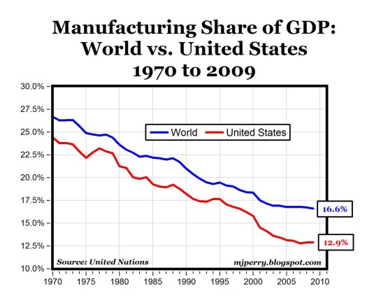
The chart above shows manufacturing output as a share of GDP for both the world and the United States using United Nations data for GDP and its components at current prices in US dollars from 1970 to 2009.
Perry notes:
We hear all the time from Donald Trump and others about the “decline of U.S. manufacturing,” about how nothing is made here any more, and how everything that used to be made here is now made in China … In reality, the decline in U.S. manufacturing as a share of GDP is really a global phenomenon as the entire world becomes increasingly a services-intensive economy.
As a share of GDP, manufacturing has declined in most countries since the 1970s. A few examples: Australia’s manufacturing/GDP ratio went from 21.3% in 1970 to 9%…
View original post 198 more words

Recent Comments