Kevin Drum posts:
I don’t really have any good hook for posting this chart, but it’s one of the most important ones you’ll ever see. It’s from the Wall Street Journal and it shows total government spending (state + local + federal) during the recession and its aftermath:
For about a year following the Obama stimulus, total spending was a bit higher than average for recession spending. But after that, spending fell steadily rather than rising, as it has after every previous recession. The result: a sluggish recovery, persistent long-term unemployment, and anemic wage growth.

Not so fast Kevin. The chart below compares Aggregate Nominal Spending (NGDP) on the same basis.
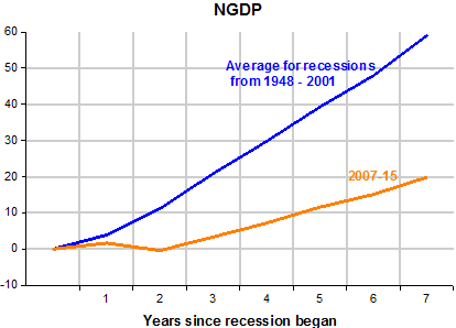
While spending fell a little for the first two years of this recession, it never faltered on the other occasions.
But, one might argue that in many other instances inflation went up a lot. Therefore, the next chart compares…
View original post 95 more words

Recent Comments