On March 31, 2017 on our twitter feed we received this comment and marked up graph from peaceful data boy @jamjoumie I wish you were applied the same skepticism of methodology to the appallingly misleading visualisations you cite
Since twitter is an unlikely forum for full explanations, we offer this blog post written up by our resident climate model and graph expert, Ken Gregory, B. AppSc. Ken has assessed models for the past decade and provides these insights on the Canadian Climate Model.
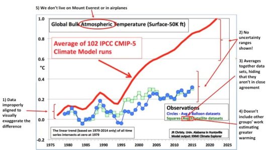
Response to Tweeted Graph with Comments
Contributed by Ken Gregory © 2017
Source of the graph is: “JH Christy”, John H. Christy from the University of Alabama in Huntsville.
About the notes on the graph below;
1) [Data improperly aligned to visually exaggerate the difference.] The box at the bottom left shows that the linear trend of all times series intersect at zero at 1979, which is…
View original post 518 more words

Recent Comments