The Reserve Bank of Australia had an interesting Bulletin article out recently, offering some insights on this chart

The RBA’s wage inflation forecasts have been persistently too strong. Mostly, they’ve forecast an acceleration of wage inflation, and yet actual wage inflation has continued to fall.
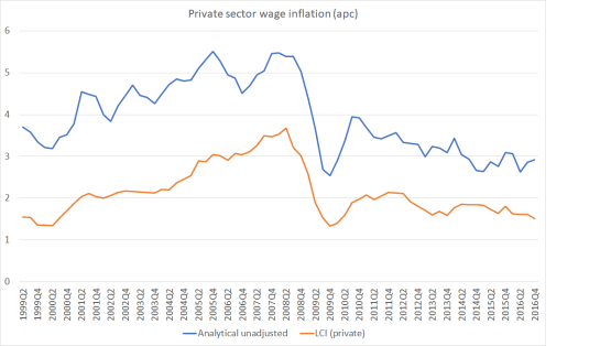
I was curious what a comparable New Zealand picture might look like. The way wage inflation series are calculated differs from country to country. In our Labour Cost Index, we have two measures of private sector wage inflation – the headline one, and what is labelled the Analytical Unadjusted series. The latter seems to be more comparable to the Australian measure in the RBA chart, while the headline LCI series attempts to adjust for changes in productivity (ie capturing only wage increases in excess of what firms identify as productivity growth). Here is what the two series look like.
The fall in New Zealand…
View original post 1,267 more words

Recent Comments