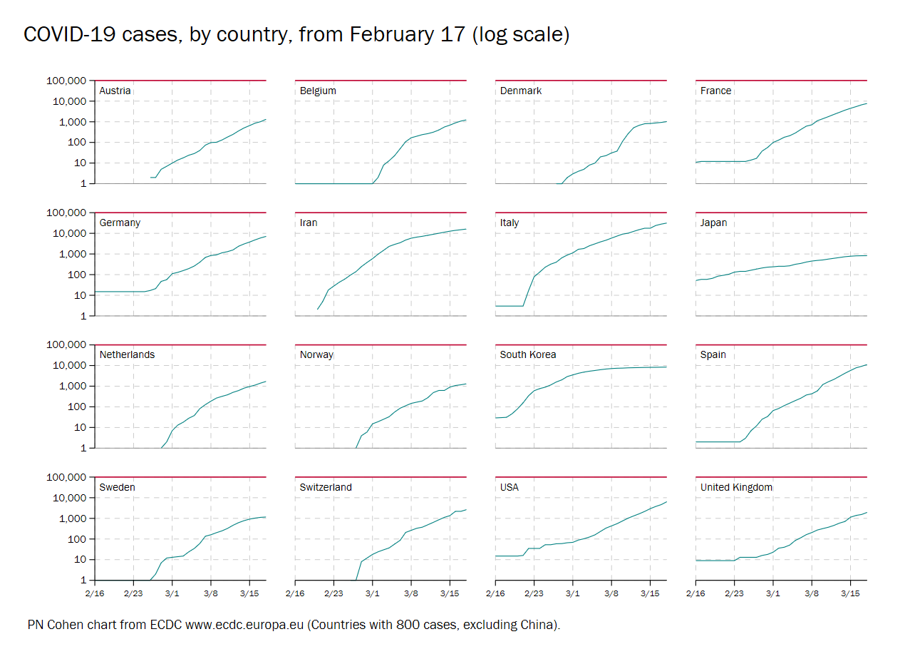
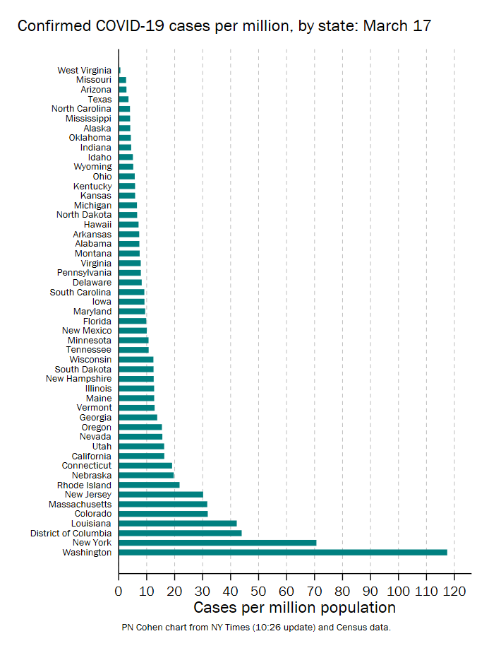
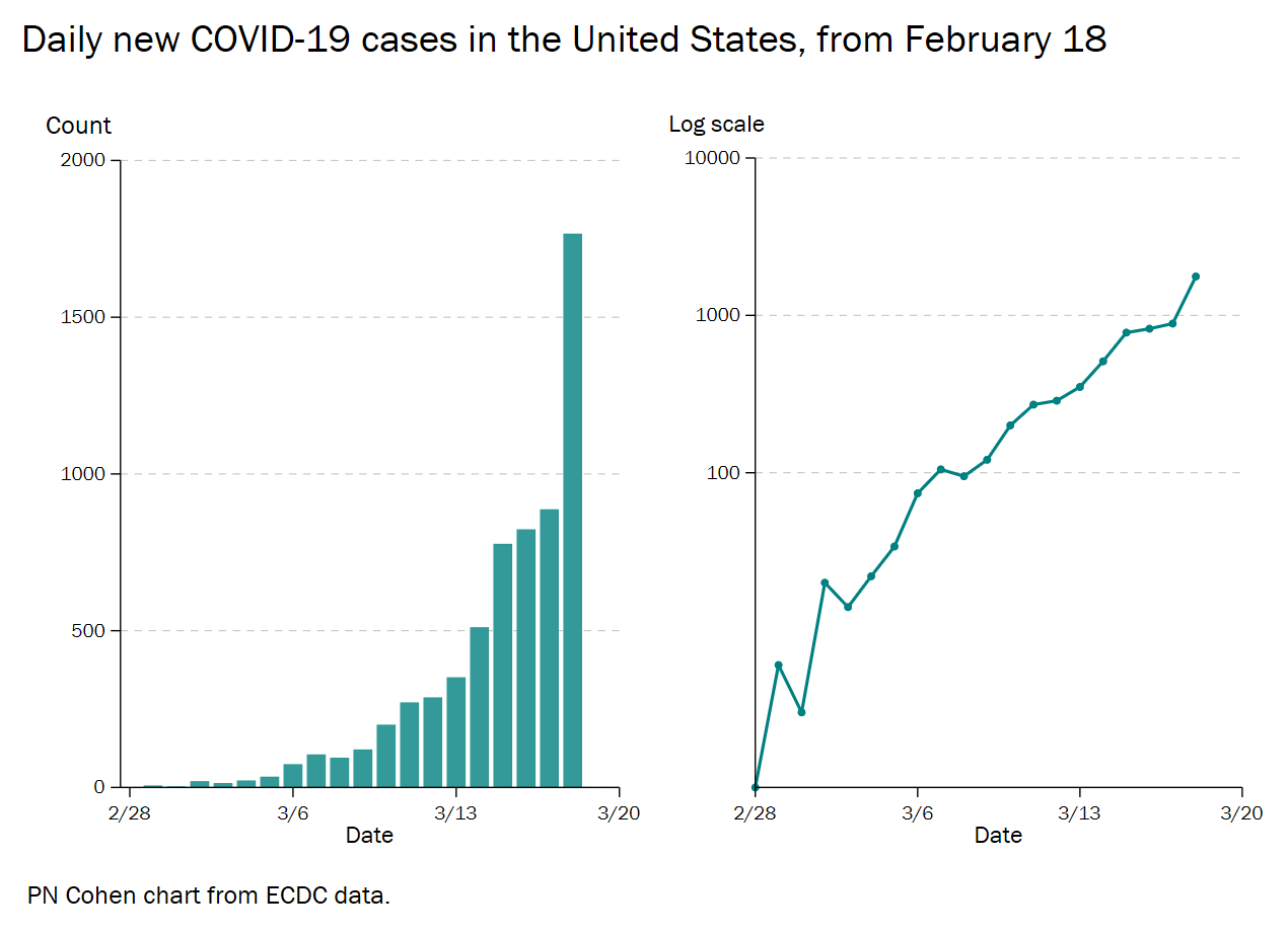
Although I’m not an expert on pandemic analysis, I am naturally following the COVID-19 data as best I can. And because I always understand data better when I make the figures myself, I’ve been making and looking at COVID-19 trend data, and sharing it as I go.
The figures below are the latest I made as of March 18. For the latest versions, and others I come up with, see the Figures folder in this Open Science Framework, here: osf.io/wd2n6/. You can also get the data and code I use there, under CC0 license. The project updates automatically as I go, but these figures won’t (because this is an old fashioned blog).


Recent Comments