I’ve been doing a bit more digging into the data on COVID-19 deaths and some of the different ways to chart the progression of the new coronavirus. Mostly I’m just catching up with thinking already done by others, but hopefully this will still be interesting.
On Saturday I tweeted a link to a handy (if grim) tool produced by ‘Our World In Data’, which allows anyone to draw their own charts. I illustrated this with a simple chart of the total number of reported deaths per million people for a selection of European countries, including the UK (pasted below). On this metric alone, the UK is currently performing less badly than some of its peers – but also worse than some others.
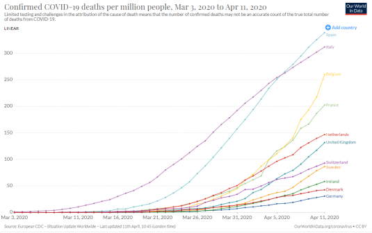
Of course, this isn’t a competition, and there is a tragedy behind every number. But I still think it’s worth asking why such large differences exist and whether this…
View original post 1,459 more words

Recent Comments