In 2022, I did a seven-part series about Bidenomics, focusing on the president’s track record on subsidies, inflation, protectionism, household income, fiscal policy, red tape, and labor-force participation.
Let’s take an updated look at his record on household income.
I’m motivated to address this issue because of a Wall Street Journaleditorial featuring this depressing chart showing that inflation-adjusted wages for the average American worker have declined during the Biden presidency.
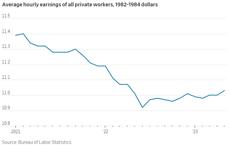
This is not a happy chart, though at least there’s been some slight improvement over the past 12 months.
Here’s some of the accompanying analysis from the WSJ‘s editorial.
…why are voters so unhappy? The answer can be found in one lesson by looking at the…chart. It tracks average real hourly earnings for all workers in the private economy across the Biden Presidency, and it tells an ugly story about the…
View original post 245 more words

Recent Comments