10 Mar 2015
by Jim Rose
in applied welfare economics, economic growth, economic history, labour economics, liberalism, poverty and inequality, Rawls and Nozick
Tags: class struggle, immiseration of the proletariat, Leftover Left, top 1%
How is the immiseration of the proletariat going to occur any time soon, and with it, the workers will rise up because they have nothing to lose but their chains, if the Australian top 1% doesn’t lift its game.
There is a serious lack of greed and expropriation of labour surplus by the top 1% in Australia. Their share of income has been falling for many decades and only increased in the last few years and then only slightly.
The top 1% is supposed to be grinding the working class down, and causing crisis after financial crisis but there’s hardly any of evidence of that in Australian income inequality data.
22 Feb 2015
by Jim Rose
in income redistribution, politics - USA, poverty and inequality, welfare reform
Tags: capitalism and freedom, poverty and inequality, The Great Enrichment, top 1%

Over the past one-, two-, and three-decade periods, both middle class and poor households have experienced noticeable gains in living standards. Their gains are slower than those experienced by middle-income families in the earlier post-war era, but the gains are well above zero.

In 1980, in-kind benefits and employer and government spending on health insurance accounted for just 6% of the after-tax incomes of households in the middle one-fifth of the distribution. By 2010 these in-kind income sources represented 17% of middle class households’ after-tax income
…The broadest and most accurate measures of household income are published by the CBO. CBO’s newest estimates confirm the long-term trend toward greater inequality, driven mainly by turbo-charged gains in market income at the very top of the distribution. The market incomes of the top 1% are extraordinarily cyclical, however. They soar in economic expansions and plunge in recessions. Income changes since 2007 fit this pattern.
What many observers miss, however, is the success of the nation’s tax and transfer systems in protecting low- and middle-income Americans against the full effects of a depressed economy.
via Gary Burtless
06 Feb 2015
by Jim Rose
in applied welfare economics, entrepreneurship, human capital, labour economics, occupational choice, politics - New Zealand, politics - USA
Tags: activists, distributive justice, do gooders, expressive voting, Leftover Left, poverty and inequality, rational ignorance, rational irrationality, top 1%
20 Jan 2015
by Jim Rose
in applied welfare economics, politics - Australia, politics - New Zealand
Tags: Leftover Left, poverty and inequlaity, top 1%
|
New Zealand |
Australia |
| Has the dispersion of earnings been increasing in recent decades? |
Yes, the top decile has risen from 143 per cent of median in 1986 to 186 per cent in 2012. |
Yes, top decile of earnings has increased from 175 per cent of median in 1975 to 215 per cent in 2012. |
| Has overall inequality increased in recent years? |
No, the Gini coefficient has been relatively stable around 32 percent since 1996. However, it rose by 7 percentage points between 1988 and 1996. |
Yes, Gini coefficient has increased by 5 percentage points since 1981. |
| Have there been periods when overall inequality fell for a sustained period? |
Yes, from mid-1950s to mid-1970s. |
Yes, overall inequality and top shares fell from early 1950s to end of the 1970s. |
| Has poverty been falling or rising in recent decades? |
Poverty has substantially increased from 1996 to 2004 before decreasing mildly till 2009. |
Risen since 1981. |
| Has there been a U-pattern for top income shares over time? |
Yes, top gross income shares fell from mid-1950s to mid-1980s, then rose from mid-1980s to mid-1990s. |
Yes, top gross income shares fell from 1921 to around 1980 and then began to rise, reaching pre-war levels before the 2007 crisis. |
| Has the distribution of wealth followed the same pattern as income? |
Insufficient evidence. |
Yes, the share in total wealth of the wealthiest 1% of the population dropped more than threefold from 1915 to the end of 1970s before rising again till the onset of 2007 crisis. However, the rise was not sufficient to return to pre-war levels of concentration. |
| Additional noteworthy features |
U-shape over post-war period. Top income shares estimates for the years 1998, 1999 and 2000 are affected by changes in the income tax laws. Top shares series have a break in 1951 (change in tax units). |
Rising inequality on all (observable) dimensions for past thirty years. |
Australia has become more unequal over the past 30 years as compared to New Zealand, but it is also become 30% richer than New Zealand.
Looks like John Rawls was right for the average Australian as compared to the average New Zealander. Australia is a more unequal society but a far richer society because of it, which is a fair deal if Rawls is to be believing.
Figure 1: New Zealand inequality chart book
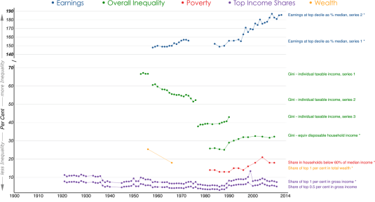
Figure 2: Australian inequality chart book
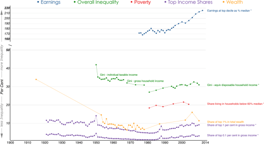
You are welcome to share but please refer to A. B. Atkinson and S. Morelli (2014) – ‘The Chartbook of Economic Inequality’ at http://www.ChartbookOfEconomicInequality.com
This visualisation is licensed under a Creative Commons BY-NC-SA license, Data visualisation by: Max Roser
20 Jan 2015
by Jim Rose
in applied welfare economics, politics - New Zealand
Tags: 2014 New Zealand election, child poverty, Gini coefficient, inequality and poverty, media bias, top 1%
Figure 1: Gini coefficient New Zealand 1980-2015

Source: Bryan Perry, Household incomes in New Zealand: Trends in indicators of inequality and hardship 1982 to 2013. Ministry of Social Development (July 2014).
Figure 2: Real household incomes (BHC), changes for top of income deciles, 1994 to 2013
![clip_image002[7]](https://utopiayouarestandinginit.com/wp-content/uploads/2014/12/clip_image0027_thumb.png?w=696&h=443)
Source: (Perry 2014).
Figure 3: Real equivalised median household income (before housing costs) by ethnicity, 1988 to 2013 ($2013).
![clip_image002[9]](https://utopiayouarestandinginit.com/wp-content/uploads/2014/12/clip_image0029_thumb2.png?w=686&h=452)
Source: (Perry 2014).

HT: http://www.listener.co.nz/current-affairs/new-deal-for-kids/

HT: http://i.stuff.co.nz/business/industries/10244667/Rich-poor-gap-not-growing-report
20 Jan 2015
by Jim Rose
in applied welfare economics, politics - New Zealand, poverty and inequality
Tags: Gini coefficient, poverty and inequality, top 1%
| Has the dispersion of earnings been increasing in recent decades? |
Yes, the top decile has risen from 143 per cent of median in 1986 to 186 per cent in 2012. |
| Has overall inequality increased in recent years? |
No, the Gini coefficient has been relatively stable around 32 percent since 1996. However, it rose by 7 percentage points between 1988 and 1996. |
| Have there been periods when overall inequality fell for a sustained period? |
Yes, from mid-1950s to mid-1970s. |
| Has poverty been falling or rising in recent decades? |
Poverty has substantially increased from 1996 to 2004 before decreasing mildly till 2009. |
| Has there been a U-pattern for top income shares over time? |
Yes, top gross income shares fell from mid-1950s to mid-1980s, then rose from mid-1980s to mid-1990s. |
| Has the distribution of wealth followed the same pattern as income? |
Insufficient evidence. |
| Additional noteworthy features |
U-shape over post-war period. Top income shares estimates for the years 1998, 1999 and 2000 are affected by changes in the income tax laws. Top shares series have a break in 1951 (change in tax units). |

You are welcome to share but please refer to A. B. Atkinson and S. Morelli (2014) – ‘The Chartbook of Economic Inequality’ at http://www.ChartbookOfEconomicInequality.com
This visualisation is licensed under a Creative Commons BY-NC-SA license Data visualisation by: Max Roser
Previous Older Entries Next Newer Entries


![Microsoft PowerPoint - Group C Federal Budget (KF).pptx [Read-Only]](https://utopiayouarestandinginit.com/wp-content/uploads/2015/02/0014_taxes-income-full.gif "Microsoft PowerPoint - Group C Federal Budget (KF).pptx [Read-Only]")


Recent Comments