The union movement posted two excellent charts during the last election showing how well things have gone since the 1980s economic reforms and their consolidation in the early 1990s.
The charts show that real wage growth returned in the early 1990s after the passage of the Employment Contracts Act and the consolidation of government finances. This was after two decades of wage stagnation in what the unions regards as the good old days.
Furthermore, as the union chart shows, the average incomes of the top 1% in New Zealand is a pretty stable for several decades. Whatever else is happening New Zealand, you cannot blame it on the top 1% because they are lazy. What increase there was in average top incomes in New Zealand was followed by the return of real wage growth in New Zealand and a long economic boom where the unemployment rate drop below 3.5%
The main bugbear is housing affordability which is a result of the Resource Management Act passed in 1993 as the union chart shows. The unions, the Labour Party and Greens all support the laws that result in this housing unaffordability.
As for New Zealand, the main difference between 70% collective bargaining agreement coverage in 1990 and less than 20% collective bargaining coverage in 2011 is real wage growth returned to New Zealand in the early 1990s after 20 years of wage stagnation. The major economic event of the time was the passage of the Employment Contracts Act.
Public and private sector union membership took completely different paths in the USA over the last 40 years. Public sector union memberships held its own. There is been a steady decline in union membership in the private sector. The exception is construction unions which held their own in membership for the last 10 years.
Union membership was in a long-term decline in New Zealand before the passage of the hated Employment Contracts Act in 1991. If anything, union membership stopped falling after the passage of that law.
Source: OECD Stat.
As for the other countries, steady decline in membership has been the trend since 1980. The already low level of union membership in the USA has been in a steady decline since at least 1960.
The Council of Trade Unions and Closer Together Whakatata Mai charted similar statistics to show that everything has gone to hell in a hand basket since neoliberalism seized power in New Zealand in 1984 and in particular after the passing of the Employment Contracts Act in 1991.
The passage of the Employment Contracts Act greatly reduced union power and union membership and with it wages growth in New Zealand, according to what is left of the New Zealand union movement.
Even the most casual inspection of the data charted above and reproduced below with some annotations shows that real wages growth returned to New Zealand in the early 1990s after 20 years of real wage stagnation.
The reforms of the 1980s stopped what was a long-term decline in average real wages. The reforms of the early 1990s including the passing of the Employment Contracts Act was followed by the resumption of sustained growth in average real wages with little interruption since.
Closer Together Whakatata Mai has even stumbled onto the great improvements in household incomes across all ethnicities since the early 1990s.
The increase in percentage terms of Maori and Pasifika real household income is much larger than for Pakeha. As Bryan Perry (2015, p. 67) explains when commenting on the very table D6 sourced by Closer Together Whakatata Mai:
From a longer-term perspective, all groups showed a strong rise from the low point in the mid 1990s through to 2010. In real terms, overall median household income rose 47% from 1994 to 2010: for Maori, the rise was even stronger at 68%, and for Pacific, 77%. These findings for longer- term trends are robust, even though some year on year changes may be less certain. For 2004 to 2010, the respective growth figures were 21%, 31% and 14%.
As Closer Together Whakatata Mai documented, incomes increased in real terms by 14% for the bottom and 19% for the middle.
Perry noted that in the lowest decile had too many implausible incomes including many on zero income so he was wary of relying on it. I have therefore charted the second, median and top decile before and after housing costs below. All three deciles charted showed substantial improvements in incomes both before and after housing costs.
Naturally, measuring changes in living standards over long periods of time is fraught with under-estimation. There are new goods to be accounted for and product upgrades too.
The Danish top 1% and top 10% is even lazier than their transnational co-conspirators. No success at all at either grinding the Danish unions down or extracting more labour surplus from the long-suffering Danish proletariat.
Source: OECD StatExtract and Top Incomes Database.
Source: OECD StatExtract and Top Incomes Database.
The Swedish top 10% and top 1% have done a bit better since the economic liberalisation in that country from the early 1990s. But none of that additional labour surplus has anything to do with grinding the unions down because Swedish union membership has not declined.
Source: OECD StatExtract and Top Incomes Database.
Source: OECD StatExtract and Top Incomes Database.
The French ruling class is as lazy as their transnational co-conspirators down under. French union membership is in serious decline albeit from a low base. An opportunity lost for the French ruling class. It has not lifted a finger to extract additional labour surplus from the downtrodden French proletariat now stripped of their only line of collective defence against capitalist exploitation.
Source: OECD Stat and Top Incomes Database.
The top 10% and top 1% in France are no better off than two generations ago despite the decline of French unions. The French Left must be most disappointed. No kicking in the rotten door of the permanent revolution anytime soon after the immiserised French proletariat rises up because it has nothing to lose but its chains. The 21st century version of the Marxist call to the barricades would be a proletariat stirred to revolution with nothing to lose but their suburban home, motorcar, IPad and air points
Source: OECD Stat and Top Incomes Database.
The Italian ruling class has had little success in bringing Italian unions down. The top 10% in Italy is earning no more now than back when the Red Brigades were gunning for them.
Source: OECD Stat and Top Incomes Database.
The top 1% in Italy is doing a little bit better than when the Red Brigade was gunning for them, but not much more. Unions don’t figure in explaining that small rise in Italian top 1% incomes over the last 40 years. Italian unions are pretty much a strong as they were 40 years ago in membership. Italian employment protection laws are pretty much as strong as they used to be too.
Source: OECD Stat and Top Incomes Database.
The Canadian ruling classes even more incompetent than their transnational co-conspirators over in Italy. There appears to have been next to no decline in union membership in Canada. The Canadian top 10% is not earning any more than back in the 60s.
Source: OECD Stat and Top Incomes Database.
The Canadian top 1% is doing a little bit better than 25 years ago also but not off the back of unions which are almost as strong as in the past. The Canadian Left will have to look for a different hypothesis than the ravages of the top 1%.
There is next to no gender wage gap even in unadjusted terms towards the bottom of the labour market. This is despite all the protestations of the Left of an inherent inequality of bargaining power between the bosses and workers.
The low paid are supposed to be powerless unless unionised. Declining unionisation is a leading explanation on the Left of the rising income shares of the top 10%, top 1% in the top 0.1%.
If that inherent inequality of bargaining power trundled out at every opportunity by the Twitter Left explains anything in the labour market, this inequality of bargaining power should be operating with greatest strength at the bottom of the labour market.
Clearly the inherent inequality of bargaining power between the bosses and workers is not doing its job regarding the gender wage gap. The gender wage gap in the USA increases as you move up the income ladder rather than the other way around.
It is interesting to note that the wage gap between genders is smaller at the 10th percentile than at the 95th. At the 10th percentile, women earn 91 percent of men’s wages while women make only 79 percent of men’s wages at the 95th percentile.
The minimum wage is partially responsible for this greater equality among the lowest earners—it sets a wage floor that applies to everyone, which means that people near the bottom of the distribution are likely to make more equal wages. Also, low-wage workers are disproportionately women, which means that the minimum wage particularly bolsters women’s wages.
…Although women have seen modest wage gains in the last several decades, the main reason the gender wage gap has slowly narrowed is that the vast majority of men’s wages have stagnated or declined.
It is a bit rich for the Economic Policy Institute to praise the minimum wage as a force for increasing incomes after spending so much of its time saying how the minimum wage has fallen way behind wages growth in general.
The gender gap lingers at the top of the labour market despite the quite substantial wage gains for women as compared to men over the past 15 years. The Economic Policy Institute dismissed the substantial gains as modest despite their own documenting of them.
It is even richer for the Economic Policy Institute to start extending the male wage stagnation hypothesis to the top 20% and top 10%.
The top of the income distribution has not been known previously known as victims of wage stagnation.
The gender wage gap remains stubbornly high at the top end of the US labour market at 20% for the last few decades. The gender wage is so large and has stayed large at the top half of the labour market for the past few decades because of compensating differentials. Women on higher incomes are balancing families and careers in choosing the occupations that best suits each individual woman, their talents and educational choices.
Studies of top earning professionals show that they make quite deliberate choices between family and career. The better explanation of why so many women are in a particular occupation is job sorting: that particular job has flexible hours and the skills do not depreciate as fast for workers who take time off, working part-time or returning from time out of the workforce. Low job turnover workers will be employed by firms that invest more in training and job specific human capital.
Higher job turnover workers, such as women with children, will tend to move into jobs that have less investment in specialised human capital, and where their human capital depreciates at a slower pace.
Women, including low paid women, select careers in jobs that match best in terms of work life balance and allows them to enter and leave the workforce with minimum penalty and loss of skills through depreciation and obsolescence.
This is the choice hypothesis of the gender wage gap. Women choose to educate for occupations where human capital depreciates at a slower pace. This gender wage gap for professionals can be explained by the marriage market combined with assortative mating:
Graduates are likely to marry each other and form power couples; and
There tends to be an age gap between men and women in long-term relationships and marriages of two years.
This two-year age gap means that the husband has two additional years of work experience and career advancement. This is likely to translate into higher pay and more immediate promotional prospects. Maximising household income would imply that the member of the household with a higher income, and greater immediate promotional prospects stay in the workforce.
This is consistent with the choice hypothesis and equalising differentials as the explanation for the gender wage gap. As Solomon Polachek explains:
At least in the past, getting married and having children meant one thing for men and another thing for women. Because women typically bear the brunt of child-rearing, married men with children work more over their lives than married women. This division of labour is exacerbated by the extent to which married women are, on average, younger and less educated than their husbands.
This pattern of earnings behaviour and human capital and career investment will persist until women start pairing off with men who are the same age or younger than them.
In low-paying jobs, there is little in the way of trade-offs other than full-time or part-time work. Low-paid jobs do not involve choosing majors at university, choosing careers, industries and employers that call for long hours and uninterrupted careers or not so long hours, fewer human capital and promotional penalties for time off and more work-life balance. The choice hypothesis is the far better explanation for the persistence of the unadjusted gender wage gap in the USA as Polachek explains:
The gender wage gap for never marrieds is a mere 2.8%, compared with over 20% for marrieds. The gender wage gap for young workers is less than 5%, but about 25% for 55–64-year-old men and women.
If gender discrimination were the issue, one would need to explain why businesses pay single men and single women comparable salaries. The same applies to young men and young women. One would need to explain why businesses discriminate against older women, but not against younger women. If corporations discriminate by gender, why are these employers paying any groups of men and women roughly equal pay?
Why is there no discrimination against young single women, but large amounts of discrimination against older married women? … Each type of possible discrimination is inconsistent with negligible wage differences among single and younger employees compared with the large gap among married men and women (especially those with children, and even more so for those who space children widely apart)
The main drivers of the gender wage gap are unknown to employers such as whether the would-be recruit or employer is married, their partner is present, how many children they have, how many of these children are under 12, and how many years are there between the births of their children.
I thought I would check how this hypothesis travelled to European offshoots such as Australia and New Zealand. For example, in the USA, top income shares have been increasing while union membership has been in decline since 1960.
Source: OECD Stat and Top Incomes Database.
Source: OECD Stat and Top Incomes Database.
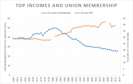
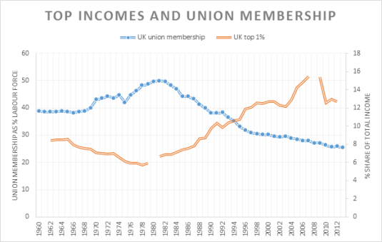
In the UK, the relationship between union membership and top incomes is gentler than in the USA.
Source: OECD Stat and Top Incomes Database.
Source: OECD Stat and Top Incomes Database.
Moving down under, the relationship between top incomes and union membership is non-existent in New Zealand.
Source: OECD Stat and Top Incomes Database.
Source: OECD Stat and Top Incomes Database.
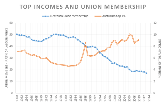
The same pretty much goes for Australia in terms of no relationship between top incomes in union membership to extent that this relationship is anything more than a spurious correlation.
Why Evolution is True is a blog written by Jerry Coyne, centered on evolution and biology but also dealing with diverse topics like politics, culture, and cats.
“We do not believe any group of men adequate enough or wise enough to operate without scrutiny or without criticism. We know that the only way to avoid error is to detect it, that the only way to detect it is to be free to inquire. We know that in secrecy error undetected will flourish and subvert”. - J Robert Oppenheimer.


Recent Comments