I’ve been tracking the economic recovery with charts and commentaries on this blog since it began in 2009. The simplest but most revealing charts compared and contrasted this recovery with the recovery of the 1980s. Here’s an update of two of those charts. The first shows the change in the employment-to-population ratio,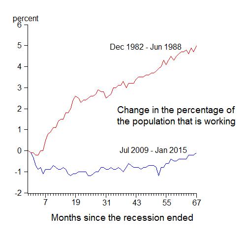
and the second shows the growth rate of real GDP for the two recoveries.
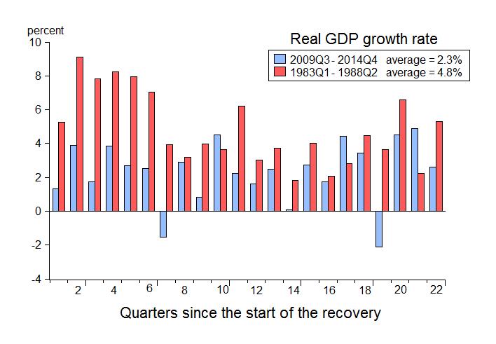
One can’t help but notice the enormous difference back at the start of this recovery, but the difference has persisted year after year for going on six years now.
At the time of the first anniversary of current recovery in 2010, it showed clear signs of weakness compared to the recovery from the recessions in the early 1980s and from all other deep recessions in American history. Some said it was a natural occurrence because of the depth of the recession, but Milton Friedman…
View original post 336 more words

Recent Comments