Over at Carpe Diem, Mark Perry has a pair rather interesting charts:
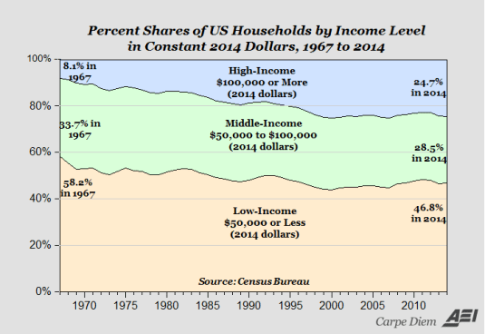
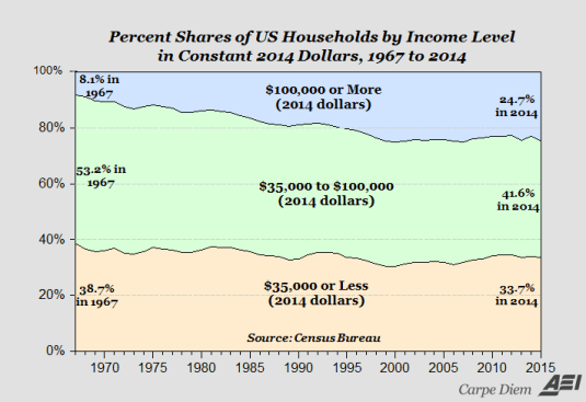
These charts show US household shares in various income groups in constant (that is, inflation-adjusted) dollars. For example, the bottom chart shoes that 24.7% of US households in 2014 earned $100,000+ per year.
Mark’s point with these charts is that the Middle Class is disappearing, but they are moving into the upper class. That certainly is true: in both charts, the Middle Class’ shares are lower in 2014 than they were in 1967. I think is also a major take-away from this is the decline in the Lower income group as well. In both cases, the Low-Income group’s shares are falling as well. In real terms, this means that fewer and fewer US households are in the bottom levels of society. So, the rich are getting richer, but the poor are getting richer, too.
This data is…
View original post 34 more words

Recent Comments