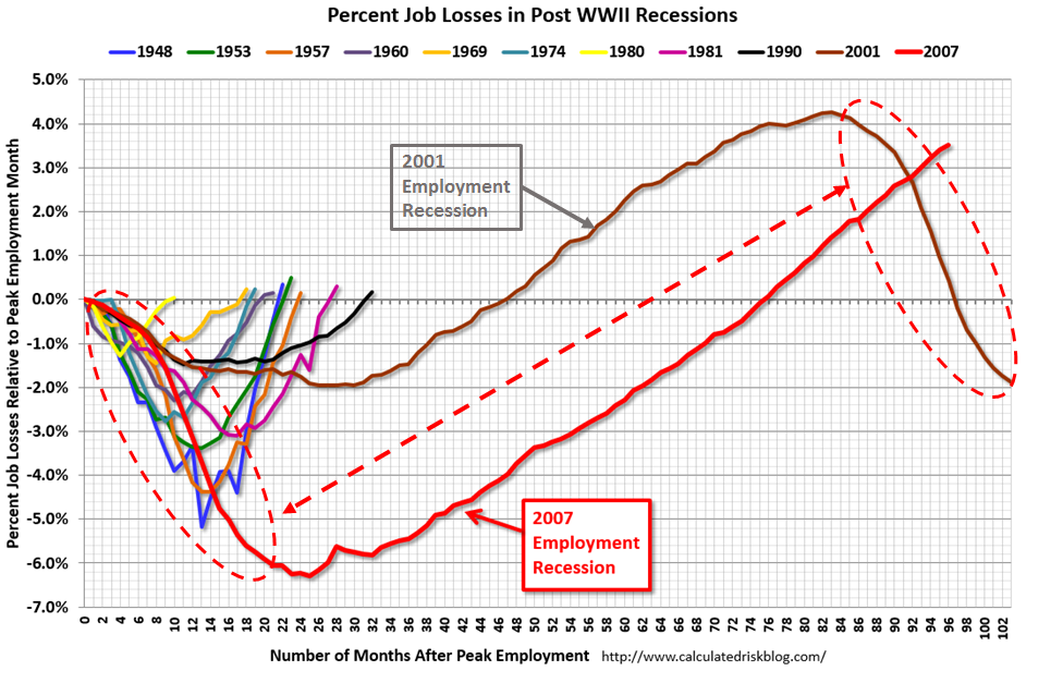
Bill McBride (Calculated Risk) posts Update: “Scariest jobs chart ever” where he presents a version of this chart
And writes:
This graph shows the job losses from the start of the employment recession, in percentage terms, compared to previous post WWII recessions. Since exceeding the pre-recession peak in May 2014, employment is now 3.5% above the previous peak.
Note: I ended the lines for most previous recessions when employment reached a new peak, although I continued the 2001 recession too. The downturn at the end of the 2001 recession is the beginning of the 2007 recession. I don’t expect a downturn for employment any time soon (unlike in 2007 when I was forecasting a recession).
By choosing to break with the way he presented the chart originally, with lines ending when the previous employment peak was reached, he ‘pollutes’ the chart, and detracts attention from an interesting characteristic.
Note that the…
View original post 379 more words

Feb 09, 2016 @ 14:31:12
I do believe he thinks lowering interest rates from low to the lowest will have a significant effect.
I have seen no empirical evidence this is the case.
Certainly Glenn Stevens of the RBA does not believe this.
LikeLike