I’ve shown previously various iterations of this chart, real GDP per hour worked for New Zealand and Australia.
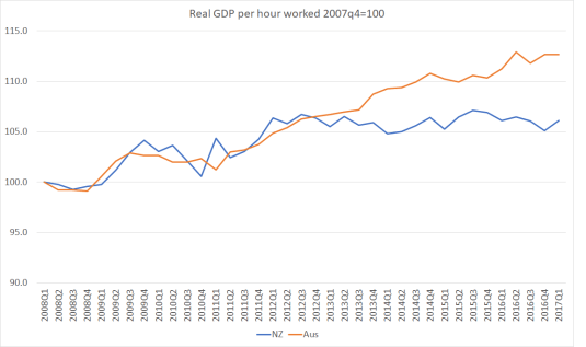
It isn’t exactly an encouraging picture for New Zealand. Then again, it is also a bit surprising. For all of New Zealand’s underperformance over the decades, we haven’t usually diverged that badly from Australia over such a short period (the last four years or so).
That chart is for the whole of each economy, and just uses a crude measure of total hours worked. The ABS and SNZ also produce annual data – with quite a lag – in which they look only at the more readily measureable market sector of the economy (from memory around 85 per cent of the economy) and also attempt to adjust for changing labour quality over time (eg improvements in education and thus, in principle, human capital).
Here is that chart for labour productivity, indexed…
View original post 851 more words

Aug 25, 2017 @ 04:30:06
Interesting. Why would growth be larger in Australia than in NZ?
LikeLike