Thanks to Swiss Policy Research for providing perspective on the coronavirus contagion in a few charts. Their article is Covid: The Big Picture in 7 Charts, updated to October 10, 2020. Excerpts in italics with my bolds.
1) Global covid “cases” and deaths vs. all-cause deaths
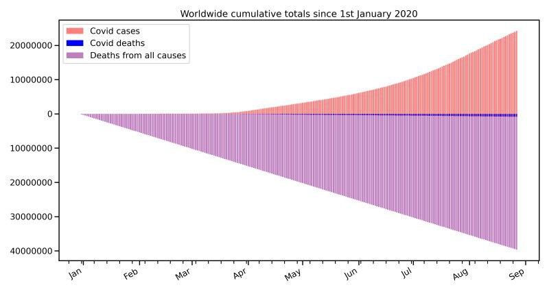
Chart number one shows global covid deaths by September in blue (about 1 million) versus global all-cause deaths in purple (about 40 million). The chart also shows the cumulative number of global covid “cases” (i.e. positive PCR tests) – the so-called “casedemic” on top of the pandemic.
In contrast, the UN expects that the political reaction to the pandemic may put the livelihood of up to 1.6 billion people at immediate risk and may, by the end of 2020, push an additional 130 million people “to the brink of starvation” and an additional 150 million children into poverty.
 Global covid deaths and…
View original post 785 more words

Recent Comments