What’s the most depressing chart in the world?
If you believe in limited government and you’re looking back in time, this example or this example are good candidates.
But if we’re looking into the future, this chart from a new study by the European Central Bank is very sobering.
And it’s a depressing chart because it doesn’t matter whether you believe in big government or small government. That’s because this chart shows a dramatic shift in population demographics.
Simply stated, Europe’s welfare states are in deep trouble because over time there will be fewer and fewer workers to pay taxes and more and more old people expecting benefits.
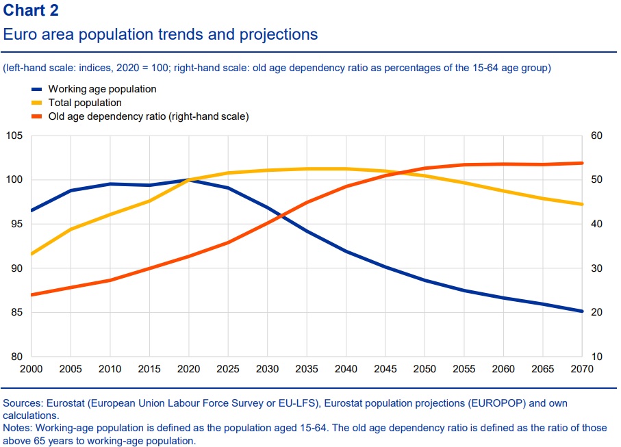
Here’s what the ECB experts, Katalin Bodnár and Carolin Nerlich, wrote about their findings.
The euro area, like many other advanced economies, has entered an era of drastic demographic change. …Declining birth rates and rising life expectancy are causing the number of…
View original post 396 more words

Recent Comments