
Policy bubbles alert: Innovation is a market process of discovery, diffusion, learning by using, entrepreneurial experimentation and decentralised adaptation
31 Oct 2014 Leave a comment

Some graphs on the great deviation on both sides of the Atlantic
31 Oct 2014 Leave a comment
in economic growth, Euro crisis, fiscal policy, global financial crisis (GFC), great depression, macroeconomics Tags: Eurosclerosis, GFC, Great Geviation, great recession
Figure 1: Actual and potential GDP in the US

Sources: Congressional Budget Office, Bureau of Economic Analysis
Figure 2: Actual and potential GDP in the Eurozone

Sources: IMF World Economic Outlook Databases, Bloomberg
HT: Larry Summers
Policy bubbles alert: most innovation is not about R&D (and boffins in lab coats)
29 Oct 2014 Leave a comment
in applied price theory, applied welfare economics, economic growth, industrial organisation Tags: economic growth, innovation, R&D, The fatal conceit, The pretence to knowledge

The fire of truth: the relationship between inequality and economic prosperity in New Zealand since the 1970s
29 Oct 2014 Leave a comment
in economic growth, economics of regulation, income redistribution, politics - New Zealand, rentseeking Tags: Auckland urban limit, economic growth, Gini coefficient, green rent seeking, poverty and inequality, Resource Management Act
Figure 1: Before Housing Costs Gini coefficient, New Zealand, 1982 – 2013

closertogether.org.nz/nzs-income-inequality-problem claims that NZ income inequality increased very rapidly in the late 1980s and 1990s — faster than in any other wealthy country.
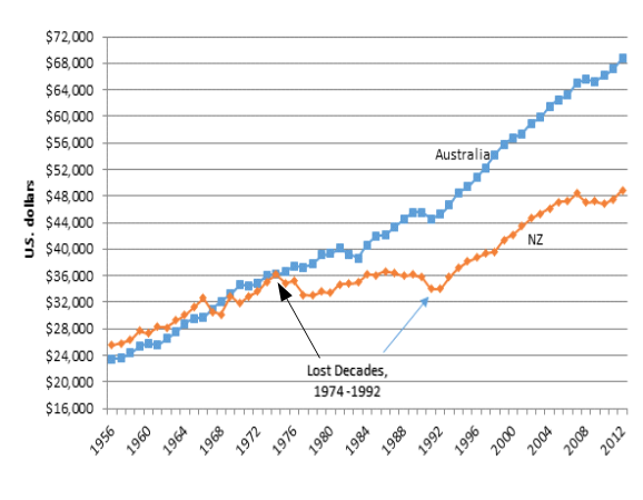
Figure 2 shows that this rapid rise in inequality coincided with the resumption of economic growth after two lost decades: next to no increase in real GDP per working age New Zealander from 1974 to 1992.
Figure 2: Real GDP per New Zealander and Australian aged 15-64, converted to 2013 price level with updated 2005 EKS purchasing power parities, 1956-2012
Source: Source: Computed from OECD Stat Extract and The Conference Board, Total Database, January 2014, http://www.conference-board.org/economics
Perry (2014) found that:
- Income inequality in New Zealand is at a similar level to Australia, Canada, Italy and Japan (Ginis of 32-33) and a little lower than the UK (34). Countries such as Denmark, Norway, Finland and Belgium have lower than average inequality (Ginis of 25-26). The US and Israel have higher scores of 39.
- The top 1% in New Zealand received around 8% of all taxable income in 2010 and 2011 (before tax), similar to Norway, Finland and Australia, lower than Ireland and Switzerland (11%) and much lower than the UK and Canada (13%) and the US (18%).
- The trend for the New Zealand share has been steady at around 8-9% since the mid 1990s, with perhaps a slight fall in the last few years. Many OECD countries saw small rises in the period, and in the USA the top 1% share continued to rise strongly, from 13% to 19%.
Perry (2014) concluded that:
Overall, there is no evidence of any sustained rise or fall in inequality in the last two decades. The level of household disposable income inequality in New Zealand is a little above the OECD median. The share of total income received by the top 1% of individuals is at the low end of the OECD rankings.
This remark by Parry that there is no evidence of any sustained rise or fall in inequality in New Zealand in the last 20 years is very much at odds with the claim of Closer Together New Zealand that income inequality inequality increased rapidly in the late 1980s and 1990s.
The increase in inequality in New Zealand was in the late 1980s and early 1990s. In the early 1990s, a long economic boom started that lasted until the global financial crisis.
Figure 3 : Income Inequality in New Zealand as Assessed by the Gini Coefficient

Source: Perry 2014 derived from Statistics NZ Household Economic Survey (HES) 1982–2012.
Figure 4: Income Inequality in New Zealand as Assessed by the P80/P20 Ratio

Source: Perry 2014 derived from Statistics NZ Household Economic Survey (HES) 1982–2012.
Figures 3 and 4 both show that after housing costs inequality in New Zealand is higher, but has been pretty stable for 20 years as measured by the Gini coefficient and by the P80/P20 ratio. (When individuals are ranked by equivalised household income and then divided into 100 equal groups, each group is called a percentile. If the ranking starts with the lowest income, then the income at the top of the 20th percentile is denoted P20; the income at the top of the 80th percentile is called P80. The ratio of the value at the top of the 80th percentile to the value at the top of the 20th percentile is called the P80/20 ratio and is often used as a measure of income inequality).
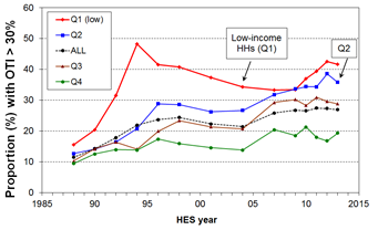
Figure 5: Proportion of HHs with housing cost outgoings to income of greater than 30%, by income quintile
Source: Perry (2014); OTI = outgoings to income
Figure 5 shows that
- for the bottom quintile (Q1), the proportion with high outgoings to income (OTI) steadily reduced from 48% in 1994 to 34% in 2004, as unemployment fell, employment and income rose, and income-related rental policies were introduced in 2000 for those in HNZC houses. From HES 2009 to HES 2013 the proportion rose strongly from 33% to 42%, the highest it has been in the last 25 years except for the peak of 48% in 1994.
- For households with incomes in the second quintile (Q2) there was a strong rise from the 1980s through to the mid 1990s, followed by a relatively flat trend to 2004. Since 2004, the proportion with high OTIs has risen strongly from 27% to 36%.
- For the third quintile (Q3) the proportion with high OTIs settled at around 30% for 2007 to 2013, up from 21% in 2004 and 10% in 1988.
Rising housing costs in New Zealand have one explanation, which is restrictions on the supply of land under the Resource Management Act.
HT: nzchildren.co.nz/income_inequality for figures 3 and 4.
Policy bubbles alert: the R&D fetish is a major threat to innovation and economic growth
28 Oct 2014 Leave a comment


Piketty on inequality: views of the IGM economic experts
16 Oct 2014 Leave a comment
in applied price theory, applied welfare economics, comparative institutional analysis, constitutional political economy, discrimination, economic growth, entrepreneurship, gender, human capital, income redistribution, industrial organisation, labour economics, Marxist economics, Rawls and Nozick Tags: Daron Acemoglu, James Robinson, Piketty, poverty and inequality, The Great Enrichment
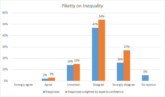
Question: The most powerful force pushing towards greater wealth inequality in the US since the 1970s is the gap between the after-tax return on capital and the economic growth rate?
Daron Acemoglu and James Robinson have a simple explanation for why Piketty is wrong:
But like Marx, Piketty goes wrong for a very simple reason. The quest for general laws of capitalism or any economic system is misguided because it is a-institutional.
It ignores that it is the institutions and the political equilibrium of a society that determine how technology evolves, how markets function, and how the gains from various different economic arrangements are distributed.
Despite his erudition, ambition, and creativity, Marx was ultimately led astray because of his disregard of institutions and politics. The same is true of Piketty.
Earl A. Thompson on fiscal and monetary policy in the Great Recession
09 Oct 2014 Leave a comment
in budget deficits, business cycles, economic growth, fiscal policy, great recession, macroeconomics, monetary economics Tags: crowding out, Earl A. Thomson, fiscal policy, great depression, great recession, permanent income hypothesis, Ricardian equivalence




Recent Comments