Will high marginal tax rates and redistribution fix inequality?
18 Oct 2015 Leave a comment
in applied price theory, applied welfare economics, entrepreneurship, human capital, labour economics, occupational choice, politics - USA, poverty and inequality Tags: Gini coefficient, rational irrationality, taxation and entrepreneurship, taxation and human capital, taxation and labour supply, taxation investment
Media completely missed this report in the lead-up to 2014 election: Rich-poor gap not growing in New Zealand and hasn’t for 20 years
20 Jan 2015 Leave a comment
in applied welfare economics, politics - New Zealand Tags: 2014 New Zealand election, child poverty, Gini coefficient, inequality and poverty, media bias, top 1%
Figure 1: Gini coefficient New Zealand 1980-2015

Source: Bryan Perry, Household incomes in New Zealand: Trends in indicators of inequality and hardship 1982 to 2013. Ministry of Social Development (July 2014).
Figure 2: Real household incomes (BHC), changes for top of income deciles, 1994 to 2013
![clip_image002[7]](https://utopiayouarestandinginit.com/wp-content/uploads/2014/12/clip_image0027_thumb.png?w=696&h=443)
Source: (Perry 2014).
Figure 3: Real equivalised median household income (before housing costs) by ethnicity, 1988 to 2013 ($2013).
![clip_image002[9]](https://utopiayouarestandinginit.com/wp-content/uploads/2014/12/clip_image0029_thumb2.png?w=686&h=452)
Source: (Perry 2014).

HT: http://www.listener.co.nz/current-affairs/new-deal-for-kids/

HT: http://i.stuff.co.nz/business/industries/10244667/Rich-poor-gap-not-growing-report
New Zealand – Chartbook of Economic Inequality
20 Jan 2015 Leave a comment
in applied welfare economics, politics - New Zealand, poverty and inequality Tags: Gini coefficient, poverty and inequality, top 1%
| Has the dispersion of earnings been increasing in recent decades? | Yes, the top decile has risen from 143 per cent of median in 1986 to 186 per cent in 2012. |
| Has overall inequality increased in recent years? | No, the Gini coefficient has been relatively stable around 32 percent since 1996. However, it rose by 7 percentage points between 1988 and 1996. |
| Have there been periods when overall inequality fell for a sustained period? | Yes, from mid-1950s to mid-1970s. |
| Has poverty been falling or rising in recent decades? | Poverty has substantially increased from 1996 to 2004 before decreasing mildly till 2009. |
| Has there been a U-pattern for top income shares over time? | Yes, top gross income shares fell from mid-1950s to mid-1980s, then rose from mid-1980s to mid-1990s. |
| Has the distribution of wealth followed the same pattern as income? | Insufficient evidence. |
| Additional noteworthy features | U-shape over post-war period. Top income shares estimates for the years 1998, 1999 and 2000 are affected by changes in the income tax laws. Top shares series have a break in 1951 (change in tax units). |

You are welcome to share but please refer to A. B. Atkinson and S. Morelli (2014) – ‘The Chartbook of Economic Inequality’ at http://www.ChartbookOfEconomicInequality.com
This visualisation is licensed under a Creative Commons BY-NC-SA license Data visualisation by: Max Roser
How New Zealand’s rich-poor divide killed its egalitarian paradise | Max Rashbrooke | The Guardian – a boy’s own fact check
13 Dec 2014 Leave a comment
in discrimination, gender, labour economics, poverty and inequality Tags: gender wage gap, Gini coefficient, poverty and inequality, top 1%
What is claimed to have gone wrong by the op-ed in The Guardian overnight?
A stark rich-poor divide, the OECD argued, had taken over a third off the country’s economic growth rate in the last 20 years. But how could this be?
The simple answer is that in the two decades from 1985 onwards, New Zealand had the biggest increase in income gaps of any developed country.
Incomes for the richest Kiwis doubled, while those of the poorest stagnated. Middle income earners didn’t do too well, either.
Are these claims true? That is, in the two decades from 1985 onwards, have the incomes of the richest Kiwis doubled, while those of the poorest stagnated and have a middle income earners not done too well either?
Figure 1 shows that prior to the recent recession starting in 2009, there were 15 years of steady growth in median household incomes. As will be shown, most of the period covered both by the op-ed in the Guardian, and by the OECD paper was an economic boom.
Figure 1: Real household income trends before housing costs (BHC) and after housing costs (AHC), 1982 to 2013 ($2013)

Source: Bryan Perry, Household incomes in New Zealand: Trends in indicators of inequality and hardship 1982 to 2013. Ministry of Social Development (July 2014).
Perry (2104) found that net income gains from the mid-1990s to 2013 were similar for all income groups, so income inequality in 2013 was also similar to the mid-1990s – see Figure 2.
Figure 2: Real household incomes (BHC), changes for top of income deciles, 1994 to 2013
![clip_image002[7]](https://utopiayouarestandinginit.com/wp-content/uploads/2014/12/clip_image0027.png "clip_image002[7]")
Source: (Perry 2014).
Importantly, in the OECD analysis, much was made of what was happening to the 40% income decile. As can be seen from figure 2, this decile gained as much as any other group in New Zealand from the income growth between 1994 and 2013.
The Gini coefficient in figure 3 , which years the most common measure of inequality, shows no evidence of a rise in income inequality since the mid-1990s. The trend-line of the genie coefficient in figure 3 is almost flat since the early 1990s .
Figure 3: Gini coefficient New Zealand 1980-2015

Source: (Perry 2014).
To make things more awkward, the large increase in income inequality in New Zealand in the late 1980s and early 1990s shown in figure 3 was followed by a 15 year economic boom after 20 years of economic stagnation – next to no income growth – as is shown in figure 4.
Figure 4: Real GDP per New Zealander and Australian aged 15-64, converted to 2013 price level with updated 2005 EKS purchasing power parities, 1956-2013

Source: Computed from OECD Stat Extract and The Conference Board, Total Database, January 2014, http://www.conference-board.org/economics
The lost decades of the growth in the 1970s and 1980s were replaced with a long boom. Trend growth of 2% per year returned after this increase in inequality – see figure 4.
The gains since the economic boom since the early 1990s has been broadly based both up and down the income distribution and by ethnicity. As shown in figure 5, between 1994 and 2010, real equivalised median household income rose 47% from 1994 to 2010; for Māori, this rise was 68%; for Pasifika, the rise was 77%.
Figure 5: Real equivalised median household income (before housing costs) by ethnicity, 1988 to 2013 ($2013).
![clip_image002[9]](https://utopiayouarestandinginit.com/wp-content/uploads/2014/12/clip_image00292.png "clip_image002[9]")
Source: (Perry 2014).
These improvements in Māori incomes since 1992 were based on rising Māori employment rates, fewer Māori on benefits, more Māori moving into higher paying jobs, and greater Māori educational attainment should be celebrated and consolidated. Māori unemployment reached a 20-year low of 8 per cent from 2005 to 2008.
As for the top 1%, as shown by Figure 6, their income share has been steady at 8-9% since the mid-1990s. It was only in the USA the top 1% share continued to rise strongly, from 13% to 19%.
Figure 6: income shares of the top 1% of earners, New Zealand, Australia and USA

source: Top incomes database
Over the last more than two decades in New Zealand, there has been sustained income growth spread across all of society. Perry (2014) concluded that:
Overall, there is no evidence of any sustained rise or fall in inequality in the last two decades.
The level of household disposable income inequality in New Zealand is a little above the OECD median.
The share of total income received by the top 1% of individuals is at the low end of the OECD rankings.
What is claimed as the causes of this growing rich-poor divide that is also slowing growth by a third?
Tracing the causes of a growing income gap is like trying to map earthquake fault lines – never a precise science – but it is hard to ignore the correlation between the timing of the increase and the country’s post-1984 political revolution.
Embracing reforms known elsewhere as Thatchernomics and Reaganomics with unprecedented enthusiasm, New Zealand halved its top tax rate, cut benefits by up to a quarter of their value, and dramatically reduced the bargaining power – and therefore the share of national income – of ordinary workers.
Thousands of people lost their jobs as manufacturing work went overseas, and there was no significant response with increased trade training or skills programmes, a policy failure that is on-going.
At the same time, New Zealand stopped building affordable houses in any serious quantity, forcing poorer households to spend ever-increasing amounts on rent and mortgages.
As will be recalled from Figure 4, the economic reforms in New Zealand were followed by a long economic boom starting in 1992 that only came to an end with the onset of the global financial crisis.
Figure 7 shows that from 1994, the proportion of the lowest income households spending more than 30% of their income on housing fell steadily, reaching 34% by 204.
Figure 7: Proportion of households spending more than 30% of their income on housing costs by income quintile, New Zealand 1988–2013 HES years

Source: Perry (2014)
Housing affordability was improving for much of the period in which the op-ed in the Guardian was claiming it was getting worse. The increase in housing unaffordability in the late 1980s and early 1990s coincided with a deep recession and a cut in welfare benefits.
Housing affordability has become an issue in New Zealand because of rising prices. Supply is not keeping up with demand.
There were considerable increases in prices throughout the house price distribution between 2004 and 2008. Median house price increasing by over 50% between 2004 and 2008; the price rises were largest among the lower price houses.
It was not a case of a decline in demand under the hypothesis that is put forward in the op-ed in the Guardian. For that hypothesis to hold, housing prices would somehow have to fall in the price range of ordinary workers. That is not the case.
Furthermore, the large increase in housing prices and decline in housing affordability occurred a decade and more after the increase in inequality in the late 1980s and early 1990s. The timing is out.
Another inconvenience for the rich poor divide hypothesis is during the housing price boom after 2004 rent to disposable income for all income quintiles remained relatively constant. Rents were stable.
Poorer households are more likely to rent, and therefore much less likely to be affected by the housing affordability crisis in New Zealand as that was mostly about home ownership.
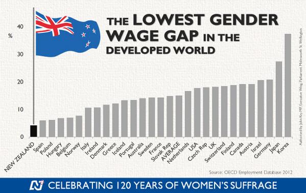
Gender analysis! Gender analysis? Where is the gender analysis? Over the last 20 to 30 years, the gender gap has closed substantially in terms of wages and employment. Young women now outnumber young men two to one at university.
New Zealand has the smallest gender wage gap in the Western world. That is inconsistent with the notion in New Zealand has a rich poor divide. Instead New Zealand appears to be an egalitarian paradise as long as you are not a boy!
The major driver of inequality in New Zealand and overseas is the rising number of two-income households made up of two well-educated parents and one or two children and many more single parent households on low pay or no one in paid employment in the house. Well-educated couples form into high income households; fewer of the less educated marry and too many end up a single mothers.

Source: closertogether.org.nz
The main cause of poverty in New Zealand is dependency on welfare benefits and in particular the number of single parents. Child poverty in beneficiary families is 75% to 80%, much higher than in families with at least one adult in full-time employment (11% in 2012 and 2013). The payment of welfare benefits to families who do not work guarantees an income to people not in a job, but it creates incentives not to work.

The economic and sociological literatures overseas increasingly suggesting that skill disparities resulting from a lower quality education and less access to good parenting, peer and neighbourhood environments produce most of the income gaps of racial and ethnic minorities rather than factors such as labour market discrimination.
The fire of truth: the relationship between inequality and economic prosperity in New Zealand since the 1970s
29 Oct 2014 Leave a comment
in economic growth, economics of regulation, income redistribution, politics - New Zealand, rentseeking Tags: Auckland urban limit, economic growth, Gini coefficient, green rent seeking, poverty and inequality, Resource Management Act
Figure 1: Before Housing Costs Gini coefficient, New Zealand, 1982 – 2013

closertogether.org.nz/nzs-income-inequality-problem claims that NZ income inequality increased very rapidly in the late 1980s and 1990s — faster than in any other wealthy country.
Figure 2 shows that this rapid rise in inequality coincided with the resumption of economic growth after two lost decades: next to no increase in real GDP per working age New Zealander from 1974 to 1992.
Figure 2: Real GDP per New Zealander and Australian aged 15-64, converted to 2013 price level with updated 2005 EKS purchasing power parities, 1956-2012

Source: Source: Computed from OECD Stat Extract and The Conference Board, Total Database, January 2014, http://www.conference-board.org/economics
Perry (2014) found that:
- Income inequality in New Zealand is at a similar level to Australia, Canada, Italy and Japan (Ginis of 32-33) and a little lower than the UK (34). Countries such as Denmark, Norway, Finland and Belgium have lower than average inequality (Ginis of 25-26). The US and Israel have higher scores of 39.
- The top 1% in New Zealand received around 8% of all taxable income in 2010 and 2011 (before tax), similar to Norway, Finland and Australia, lower than Ireland and Switzerland (11%) and much lower than the UK and Canada (13%) and the US (18%).
- The trend for the New Zealand share has been steady at around 8-9% since the mid 1990s, with perhaps a slight fall in the last few years. Many OECD countries saw small rises in the period, and in the USA the top 1% share continued to rise strongly, from 13% to 19%.
Perry (2014) concluded that:
Overall, there is no evidence of any sustained rise or fall in inequality in the last two decades. The level of household disposable income inequality in New Zealand is a little above the OECD median. The share of total income received by the top 1% of individuals is at the low end of the OECD rankings.
This remark by Parry that there is no evidence of any sustained rise or fall in inequality in New Zealand in the last 20 years is very much at odds with the claim of Closer Together New Zealand that income inequality inequality increased rapidly in the late 1980s and 1990s.
The increase in inequality in New Zealand was in the late 1980s and early 1990s. In the early 1990s, a long economic boom started that lasted until the global financial crisis.
Figure 3 : Income Inequality in New Zealand as Assessed by the Gini Coefficient

Source: Perry 2014 derived from Statistics NZ Household Economic Survey (HES) 1982–2012.
Figure 4: Income Inequality in New Zealand as Assessed by the P80/P20 Ratio

Source: Perry 2014 derived from Statistics NZ Household Economic Survey (HES) 1982–2012.
Figures 3 and 4 both show that after housing costs inequality in New Zealand is higher, but has been pretty stable for 20 years as measured by the Gini coefficient and by the P80/P20 ratio. (When individuals are ranked by equivalised household income and then divided into 100 equal groups, each group is called a percentile. If the ranking starts with the lowest income, then the income at the top of the 20th percentile is denoted P20; the income at the top of the 80th percentile is called P80. The ratio of the value at the top of the 80th percentile to the value at the top of the 20th percentile is called the P80/20 ratio and is often used as a measure of income inequality).
Figure 5: Proportion of HHs with housing cost outgoings to income of greater than 30%, by income quintile

Source: Perry (2014); OTI = outgoings to income
Figure 5 shows that
- for the bottom quintile (Q1), the proportion with high outgoings to income (OTI) steadily reduced from 48% in 1994 to 34% in 2004, as unemployment fell, employment and income rose, and income-related rental policies were introduced in 2000 for those in HNZC houses. From HES 2009 to HES 2013 the proportion rose strongly from 33% to 42%, the highest it has been in the last 25 years except for the peak of 48% in 1994.
- For households with incomes in the second quintile (Q2) there was a strong rise from the 1980s through to the mid 1990s, followed by a relatively flat trend to 2004. Since 2004, the proportion with high OTIs has risen strongly from 27% to 36%.
- For the third quintile (Q3) the proportion with high OTIs settled at around 30% for 2007 to 2013, up from 21% in 2004 and 10% in 1988.
Rising housing costs in New Zealand have one explanation, which is restrictions on the supply of land under the Resource Management Act.
HT: nzchildren.co.nz/income_inequality for figures 3 and 4.

Recent Comments