
Source: Workers’ Compensation: Growing Along with Productivity.
Workers’ Compensation: Growing Along with Productivity
04 Jun 2016 Leave a comment
in applied welfare economics, economic history, politics - USA Tags: living standards, measurement error, middle class stagnation, wage stagnation
Gap in GDP per Australian, Canadian, French, German, Japanese, New Zealander and British hour worked with the USA
28 May 2016 Leave a comment
in economic growth, economic history, labour economics, labour supply, macroeconomics, politics - Australia, politics - New Zealand, politics - USA, public economics Tags: Australia, British economy, Canada, Eurosclerosis, France, Germany, Japan, labour productivity, measurement error, taxation and labour supply
This data tells more of a story than I expected. Firstly, New Zealand has not been catching up with the USA. Japan stopped catching up with the USA in 1990. Canada has been drifting away from the USA for a good 30 years now in labour productivity.
Data extracted on 28 May 2016 05:15 UTC (GMT) from OECD.Stat from OECD Compendium of Productivity Indicators 2016 – en – OECD.
Australia has not been catching up with the USA much at all since 1970. It has maintained a pretty consistent gap with New Zealand despite all the talk of a resource boom in the Australia; you cannot spot it in this date are here.
Germany and France caught up pretty much with the USA by 1990. Oddly, Eurosclerosis applied from then on terms of growth in income per capita.
European labour productivity data is hard to assess because their high taxes lead to a smaller services sector where the services can be do-it-yourself. This pumps up European labour productivity because of smaller sectors with low productivity growth.
Did the rise of welfare state cause more inequality in wealth?
18 Apr 2016 Leave a comment
in fiscal policy, labour economics, labour supply, macroeconomics, poverty and inequality, public economics Tags: growth of government, income inequality, measurement error, Ricardian theory of budget deficits, Social Security, top 1%, wealth inequality
Markus Poschke and Barış Kaymak have just put out a paper arguing that increased social spending is a major driver of wealth inequality:
Another important and often overlooked third factor is the rise in the generosity of government transfers since 1960, mostly due to the expansion of public pensions (social security) and the introduction of public health insurance for the elderly (Medicare).
Combined spending on these two programs accounted for almost 9% of US GDP in 2010, up from less than 3% in 1960…
These government programmes tend to curb the need to rely on personal savings for retirement, especially among low and middle-income households, and might thus explain why their share in total wealth has declined.
This makes a good to good degree of sense. I have previously argued that using the arguments of Edward Prescott that it is not wise for people on ordinary income to save for their retirement when they can go down to the local Social Security office and claim an old age pension.
51% of nonretirees doubt they will receive Social Security… on.gallup.com/1NcwzEa #GallupDaily http://t.co/ZhKnHYtr1X—
(@GallupNews) August 13, 2015
It is even less wise to save that for retirement if those savings reduce your eligibility for an old age pension. Far better just to invest in a nicer house and pass it on to your children. Poschke and Kaymak note that measures of private wealth inequality miss these claims to old age pensions:
… statistics on wealth inequality that do not capture households’ claims on the public sector are incomplete and overstate top wealth shares.
This is not a new argument. Back when the Ricardian theories of budget deficits came to prominence and before that in debates on theories of the public debt, the more Keynesian sides of those arguments did argue that people were irrational for not including their old age pension entitlements under social security schemes in their calculations of their wealth.

Some of their taxes were paying for their future old age pension and were another form of wealth rather than a tax. As such, taxpayers should regard this part of their taxes as investments and not cutting back their labour supply in response as they do to other taxes.

How much of the rise in wealth inequality is due to this failure to measure Social Security wealth as represented by old age pension entitlements? Their estimate is about 25%:
…technological factors play a dominant role not only for changes in income inequality, as is well known, but also for wealth inequality. As high-earning households save part of their additional income, their share of wealth also rises.
This channel accounts for about half of the total increase in wealth inequality. Tax cuts and the expansion of transfers each account for about half of the remainder…
While tax cuts encourage saving, larger transfers reduce saving incentives for retirement, in particular for low and middle income groups. This implies that these groups’ share of private wealth declines.
Note though that this is partly due to the fact that measures of private wealth inequality, like those compiled by Saez and Zucman, do not include claims to future government transfers, like social security, which constitute wealth for their owners.
The importance of correctly measuring income growth over the decades
31 Jan 2016 Leave a comment
in applied welfare economics, economic history Tags: measurement error
New Zealand inflation rate adjusted for CPI measurement bias since 1970
20 Jan 2016 Leave a comment
in applied price theory, business cycles, economic growth, economic history, macroeconomics, monetary economics, politics - New Zealand Tags: CBI bias, inflation rate, measurement error, price indexes
1% to 1.5% is the usual estimate of bias in the consumer price index because of the introduction of new groups and quality upgrades in existing goods. I have adjusted the consumer price index inflation rate back to 1970 in New Zealand by 1.5% to see how long ago prices became stable. I know this is a rough adjustment, but it is still informative. If anything, the bias in the consumer price index from new goods and product upgrades is increasing rather than decreasing.

Source: Reserve Bank of New Zealand.
Prices have been stable or falling in New Zealand’s for at least three years now once bias in the consumer price index is taken into account. Despite this deflation, the economy seems to be getting along pretty well. There is also a long period of more or less stable prices in the 1990s once bias is taken into account in the measurement of consumer prices by the Statistics New Zealand.
@RobinHoodTax @helenkellyCTU does the average worker earn less than 40 years ago?
30 Sep 2015 Leave a comment
in applied welfare economics, economic history, Marxist economics, politics - New Zealand, politics - USA Tags: good old days, living standards, measurement error, middle class stagnation, productivity measurement, The Great Enrichment, wage stagnation
https://twitter.com/RobinHoodTax/status/648963471690698752/photo/1
For Economic Justice, America Badly Needs Some Raises goo.gl/iA3Ecp #RobinHoodTaxUSA robinhoodtax.org/why http://t.co/0wx4kCpb4Q—
Robin Hood Tax (@RobinHoodTax) September 23, 2015
Innovation is letting us accomplish more with less. Learn more: buff.ly/1LmtAZD #tech #progress http://t.co/e2kQlGu3NA—
HumanProgress.org (@humanprogress) June 22, 2015
When do rising incomes increase child poverty?
22 Aug 2015 2 Comments
in economic history, labour economics, politics - New Zealand, poverty and inequality, welfare reform Tags: child poverty, family poverty, Leftover Left, measurement error, New Zealand Greens
Summary of the 222 pages of MSD's Household Incomes report: kids are still missing out BIG time. #itsnotchoice http://t.co/4x7dm1O0Wg—
Child Poverty NZ (@povertymonitor) August 13, 2015
AHC = after deducting housing costs
BHC = before deducting housing costs
‘anchored line’:
- this is the line set at a chosen level in a reference year (now 2007), and held fixed in real terms (CPI adjusted)
- the concept of ‘poverty’ here is – have the incomes of low-income households gone up or down in real terms compared with what they were previously?
‘moving line’:
- this is the fully relative line that moves when the median moves (e.g. if median rises, the poverty line rises and reported poverty rates increase even if low incomes stay the same)
- the concept of ‘poverty’ here is – have the incomes of low-income households moved closer or further away from the median?
Bryan Perry, Household Incomes in New Zealand: trends in indicators of inequality and hardship 1982 to 2014 – Ministry of Social Development, Wellington (August 2015), p. 133.

Source: Bryan Perry, Household Incomes in New Zealand: trends in indicators of inequality and hardship 1982 to 2014 – Ministry of Social Development, Wellington (August 2015), p. 133.
Is child poverty in New Zealand 245,000 children or 305,000 children?
260,000 kids in income poverty, 180,000 in material hardship, 10% in severe poverty, 3in5 in poverty for a long time http://t.co/Oy5cWftvwU—
Child Poverty NZ (@povertymonitor) May 21, 2015
If you base your estimate of child poverty on the 60% of median income after housing costs moving line, which is the number of low income households who moved further away from 60% of median income, a median which increased by 5% last year, the figure is 305,000 children after housing costs. 45,000 children are in households that is not as close to the median as last year but are not necessarily any poorer than last year in terms of money coming into the house.
45k more children in #poverty this year than last, that’s 305k Kiwi kids without life's basics. C'mon @johnkeypm! http://t.co/K8zeQpgA79—
UNICEF New Zealand (@UNICEFNZ) August 13, 2015
If you base your estimate on the anchored line, which is the number of low income households whose income has gone up on down compared to what they were on previously,the number of children in poverty has increased from 235,000 to 245,000 after housing costs. About 10,000 children are poorer than last year – poorer enough than last year to be classified as in poverty.

Why we shouldn’t rely too much on GDP and Human development index to tell us how we are doing
15 Aug 2015 Leave a comment
in applied price theory, applied welfare economics, development economics, economic history, economics of media and culture Tags: measurement error, The Great Enrichment, The Great Escape, The Great Fact
Whitman ECON 101: Principles of Microeconomics
Up to now, I personally think we are yet to come up with a more accurate and adequate way of measuring our welfare, our quality or standard of living, that is, how happy we feel in our lives or how enjoyable and satisfying our lives are. If this is what we are measuring GDP (output) is in so many ways an inadequate measure of welfare because it is concentrating on output, it focuses more on commodities therefore GDP does not capture the happiness and joy got from family and social networks. So some economists have tried to come up with new ways to better measure GDP as a measure of our welfare, and they have broken down welfare into three things that they believe constitute welfare. Firstly, welfare has something to do with consumption of goods and services giving us utility, pleasure, or happiness. Secondly, it also has something to…
View original post 722 more words
Measurement error in the computer age
18 Jul 2015 1 Comment
in applied welfare economics, econometerics, economic history, entrepreneurship, technological progress Tags: age of the computer, capitalism and freedom, measurement error, Robert Solow

India at night in 1994 and 2010 – Estimating Poverty Using Nightlights
27 Jun 2015 Leave a comment
in development economics, econometerics, economic history, growth disasters, growth miracles Tags: India, measurement error, national accounts

Maxim Pinkovskiy and Xavier Sala-i-Martin last year suggested that national accounting estimates of poverty should be adjusted for the evolution of satellite-recorded night-time lights. I agree from personal experience.
In India between 1994 and 2010, its survey income grew by 29% but its GDP per capita more than doubled during this time. We see that lights in India increase dramatically both in their intensity over the major cities as well as in their extent over previously dark areas of the country. This suggests that the GDP estimate is a more accurate assessment of economic development of India and the faster reduction of poverty than income surveys suggest.

Source: The Conference Board. 2015. The Conference Board Total Economy Database™, May 2015, http://www.conference-board.org/data/economydatabase/
National accounting data on real GDP, PPP would suggest that Indonesia is a much wealthier country than the Philippines. The Philippines from about the late 1998, has had rapid economic growth, but so has Indonesia. I first visited the Philippines in 1997. I have never visited Indonesia.

When I first visited my parents-in-law in the Philippines in 1998, that part of Leyte had no sealed roads and no phones.
The next time I visited, the road was being sealed and mobile reception was better if you had an aerial on the roof.
After a five year gap in visiting, not only was mobile reception good, there was cable TV if you wanted it. When I visited in 2012, there was wireless internet if you had outside aerial.
Christmas before last, we hot spotted off my sister-in-law’s mobile. Neighbours have Skype if we want to say hello. I don’t know how that rapid change in economic fortunes is captured accurately in national accounting figures.
How great was the Great Depression unemployment? The official and Darby estimates of US unemployment in the 1930s
17 Jun 2015 Leave a comment
in business cycles, economic history, great depression, labour economics, macroeconomics, unemployment Tags: Euro sclerosis, measurement error, Michael Darby
The graph below shows two different series for unemployment in the 1930s in the USA: the official BLS level by Lebergott; and a data series constructed famously by Michael Darby.
Figure 1: US unemployment rate, 1929 – 40: Darby and Lebergott estimates

Source: Robert Margot (1993).
Darby includes workers in the emergency government labour force as employed – the most important being the Civil Works Administration (CWA) and the Works Progress Administration (WPA). Once these workfare programs are accounted for, the level of U.S. unemployment fell from 22.9% in 1932 to 9.1% in 1937, a reduction of 13.8%.
For 1934-1941, the corrected unemployment levels are reduced by two to three-and-a half million people and the unemployment rates by 4 to 7 percentage points after 1933.
Not surprisingly, Darby titled his 1976 Journal of Political Economy article Three-and-a-Half Million U.S. Employees Have Been Mislaid: Or, an Explanation of Unemployment, 1934-1941. The corrected data by Darby shows stronger movement toward the natural unemployment rate after 1933.
From about 1935, the unemployment rate in the Great Depression in the USA is not much different from what it is in Europe in recent decades under Eurosclerosis.
In the 1930s in the USA, many unemployed were employed by the Civil Works Administration and the Works Progress administration. In contemporary Europe, the unemployed are simply paid not to work under their welfare state arrangements.
The rise and rise of intangible investment
06 Dec 2014 Leave a comment
in business cycles, economic growth, macroeconomics Tags: intangible investment, measurement error, real business cycles
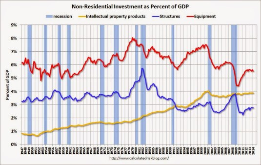
Only in 2013 did the US statistical agencies start publishing data on intellectual property products under the heading of investment. Previously, these investments were immediately expensed, which understated investment and overstated productivity.
You will note the sharp rise in intellectual property investment during the 1990seconomic boom. The collapse of the IT bubble in 2000 coincided with the drop in intellectual properties investment.

Recent Comments