Each time has its own fear of the new.
18th century warning from England(!) regarding tea bit.ly/1K8zect http://t.co/DAJLJBQdfS—
Max Roser (@MaxCRoser) September 09, 2015
When tea houses were dens of inequity
23 Oct 2015 Leave a comment
in economic history, economics of media and culture, economics of regulation Tags: meddlesome preferences, nanny state
US gender wage gap at 10th, 50th and 90th percentile
21 Oct 2015 2 Comments
in discrimination, economic history, gender, politics - USA
In common with New Zealand, the most persistent gender pay gap is at the top end of the labour market. There is more gender equality among the lowest paid female workers than the highest-paid female workers. The gender pay gap for the top 10% of female workers has been static for 20 years. Gender pay gaps for female workers at the median weekly earnings for a full-time worker and at the bottom have been still closing albeit slowly over that same 20 years.

Source: OECD Employment Database.
Are @vngalasso @OxfamAmerica @dpaulobrien Great Escape deniers? @WhitefordPeter
21 Oct 2015 Leave a comment
in development economics, economic history, growth miracles Tags: Leftover Left, life expectancy, The Great Escape, The Great Fact, Twitter left
https://twitter.com/MaxCRoser/status/656144668468641793
In 1800 there was no country with a life expectancy over 40.
bit.ly/1C8oCsK http://t.co/Ow7gE4F1qL—
Max Roser (@MaxCRoser) October 19, 2015
From my project: bit.ly/1IfQSjg
Huge progress in education in #Africa between 1950 and 2010! https://t.co/oipFNpPTqy—
Max Roser (@MaxCRoser) October 20, 2015
When more infants survive the birth rate goes down.
From: ourworldindata.org/data/populatio… https://t.co/zIZ1jNc1w5—
Max Roser (@MaxCRoser) October 20, 2015
A Graph for Pope Francis: If You Want to Help the Poor, You Should Embrace Capitalism. Exhibit A: See Chart http://t.co/yG1ixKZxrJ—
Mark J. Perry (@Mark_J_Perry) September 21, 2015
Chinese & Indian female life expectancies as a sign of broad-based economic growth
20 Oct 2015 Leave a comment
in development economics, economic history, growth miracles, health economics
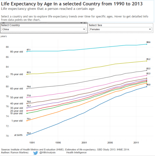
In the last 20 years in India, life expectancy at birth increased by 10 years. The same in China. There were increases in Chinese and Indian life expectancies across all age bands.
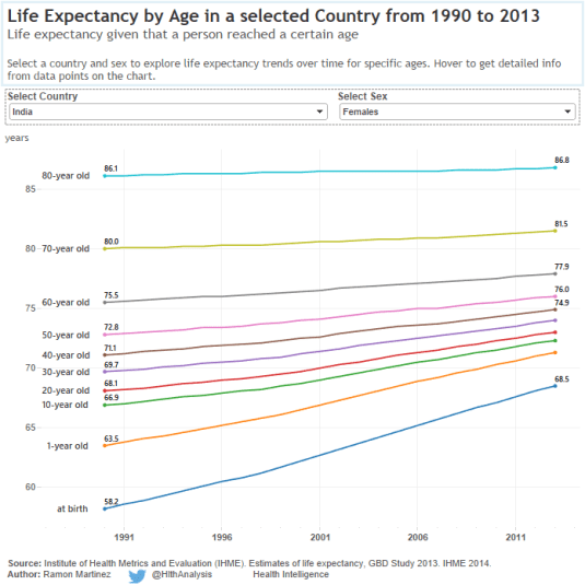
The difference between the two countries is the low base in India which was 58 years versus 70 years in China for life expectancy at birth. Obviously, recovering from the Permit Raj has been a bit of a struggle for socialist India. Either way, such a rapid increase in life expectancy in India and China suggests broad-based economic growth in the last 20 years.
If you look at China and India over the longer term and compare it with capitalism, again the socialist solution comes up short. The initial improvements in life expectancies in India and China in the mid-20th century were simply curing of endemic diseases and childhood illnesses. Hong Kong and Macau were miles ahead of China until China took the capitalist road.
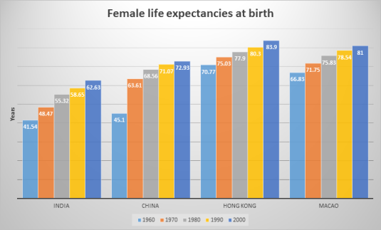
Source: Cleo Infra.
In the 10 years from 2000, China close that gap in female life expectancies of birth through the blessings of capitalism but not as much freedom as we might have hoped. That said, if you stay out of politics in China, you can run a business, raise a family and travel and study abroad. China is now a tin-pot dictatorship rather than a totalitarian dictatorship. That’s a major improvement.
The differences in Hong Kong and Macau life expectancies is also a good measure of the advantages of being colonised by the British rather than the Portuguese.
Capitalism delivers growth miracles – Twitter Left still grumbles
20 Oct 2015 Leave a comment
in development economics, economic history, growth disasters, growth miracles
#inequality matters for achieving the end of #poverty. #EvenItUp @OxfamAmerica @dpaulobrien https://t.co/Ld9qhJhfcl—
Nick Galasso (@vngalasso) October 19, 2015
The Left over Left would grumble at the gates of heaven.
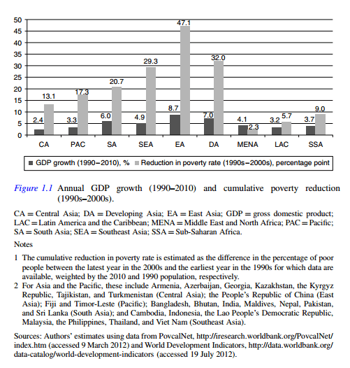
Source: Inequality in Asia and the Pacific | Asian Development Bank.
The fact that most of the Twitter Left would have to go through the eye of a needle would not dawn of them. They would be more interested in whether there was free Wi-Fi.
where do the extreme poor live? this @worldbank graphic wont tell you as it ignores new survey data 4 Nigeria & India http://t.co/APb0M0TuYK—
Laurence Chandy (@laurencechandy) April 14, 2014
The latest grumblings of the Twitter Left is after the World Bank announced that extreme poverty is to drop below 10% of the world’s population for the first time ever.
Rather than celebrate this tremendous achievement of capitalism and freedom, the Twitter Left grumbles about inequality.
A look at hunger reduction → performance + projections by region: brook.gs/1FWLLOS http://t.co/ELNzKn6BCQ—
Brookings Global (@BrookingsGlobal) June 16, 2015
A legitimate reason for the opposition to capitalism in Latin America is crony capitalism. This is opposed to the competitive capitalism that produces economic miracles. Becker defines crony capitalism as
…a system where companies with close connections to the government gain economic power not by competing better, but by using the government to get favoured and protected positions. These favours include monopolies over telecommunications, exclusive licenses to import different goods, and other sizeable economic advantages. Some cronyism is found in all countries, but Mexico and other Latin countries have often taken the influence of political connections to extremes.
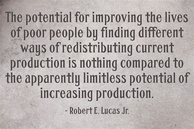
Nearly all of Asia (where much of the world’s population lives) has undergone rapid and sustained economic and social progress because they became market economies, starting with the Asian Tigers and recently in previously socialist India and communist China.
Growth paths of #LatAm & the Caribbean the South East Tigers: wrld.bg/NCtLt #RiseoftheSouth http://t.co/IFuUOWldox—
World Bank Pubs (@WBPubs) May 31, 2015
Latin America adopted the inward economic policies of the mid-20th century that renegade liberals praise so much and they became development disasters.
How can we eradicate #poverty by 2030? @Winnie_Byanyima wef.ch/1QvSVPW #development http://t.co/reBsT24BU3—
World Economic Forum (@wef) September 24, 2015
The trend in past several decades in most countries has been toward more open economies with greater competition within industries. There is more reliance on private enterprise, and with a reduced role for government, government-run enterprises, and cronyism.
Hot off the press: @WorldBank publishes new global poverty estimates and forecasts. 1.01 billion < $1.25/day in 2011 http://t.co/cGfdEAdOMo—
Laurence Chandy (@laurencechandy) October 08, 2014
As the world embraced free market policies in the late 20th century, living standards rose sharply; life expectancy, education and democracy improved and absolute poverty declined.
Xavier Sala-I-Martin and Maxim Pinkovskiy (2010) found that between 1970 and 2006, extreme poverty fell by 86% in South Asia, 73% in Latin America, 39% in the Middle East and 20% in Africa.
The percentage of people living on less than $1 a day (in PPP-adjusted 2000 dollars) fell from 26.8% in 1970 to 5.4% in 2006.
#Africa represents the last hurdle to ending extreme #poverty ($1.25 per day) → brook.gs/1JS4EUH http://t.co/ihDFc6R3ly—
Brookings Global (@BrookingsGlobal) July 29, 2015
Xavier Sala-I-Martin also estimated eight indexes of income inequality. All of them show reductions in global inequality during the 1980s and 1990s.
Top tax rates across the OECD
20 Oct 2015 Leave a comment
in economic history, public economics Tags: Marginal tax rates
In which country would you be paying almost 60% #tax? wef.ch/1LohICw http://t.co/AtJ27pcTh3—
World Economic Forum (@wef) October 16, 2015
German, French and Italian real housing prices since 1975
19 Oct 2015 Leave a comment
in applied price theory, applied welfare economics, economic history, economics of regulation, rentseeking, urban economics Tags: France, Germany, housing affordability, housing prices, Italy, land supply, land use planning, zoning
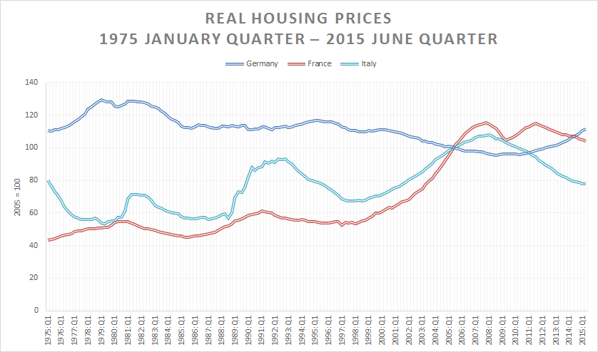
Source and notes: International House Price Database – Dallas Fed June 2015; nominal housing prices for each country is deflated by the personal consumption deflator for that country.
@BernieSanders @JeremyCorbyn4PM in 1962, people in 51 nations ate <2000 calories a day – how many do today?
19 Oct 2015 Leave a comment
in development economics, economic history, growth disasters, growth miracles Tags: child poverty, extreme poverty, global hunger, global poverty, The Great Escape
In 1962, people in 51 countries consumed <2000 calories per day. In 2011? One. buff.ly/1PmjIRK #WorldFoodDay http://t.co/zdJRWK1Mtj—
HumanProgress.org (@humanprogress) October 16, 2015
Israel-Palestine: 2 Very Different Narratives
19 Oct 2015 Leave a comment
Israel-Palestine: 2 Very Different Narratives http://t.co/I64ysntpu5—
ian bremmer (@ianbremmer) October 18, 2015
Creative destruction in technology acquisitions
19 Oct 2015 Leave a comment
in economic history, entrepreneurship, industrial organisation, survivor principle Tags: creative destruction, entrepreneurial alertness, market for corporate control, mergers and takeovers
The 12 biggest #technology acquisitions of all time wef.ch/1QrO2b5 http://t.co/Dx0YTm8NpA—
World Economic Forum (@wef) October 15, 2015
British and Irish real housing prices since 1975
18 Oct 2015 Leave a comment
in applied price theory, applied welfare economics, economic history, economics of regulation, urban economics Tags: British politics, housing prices, Ireland, land supply, land use planning, zoning
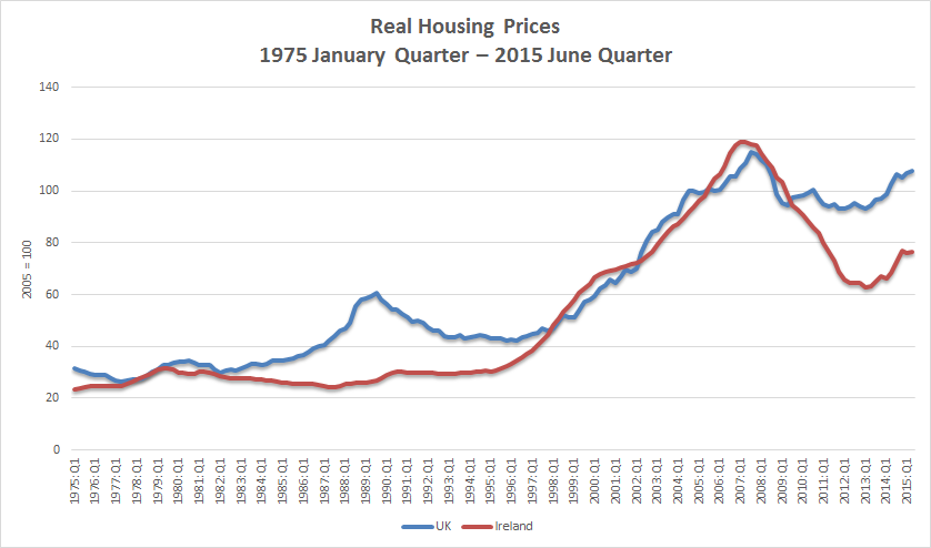
Source and notes: International House Price Database – Dallas Fed June 2015; nominal housing prices for each country is deflated by the personal consumption deflator for that country.
The Great Escape into the middle class in the Third World
18 Oct 2015 Leave a comment
#Dailychart: In almost every country, mortality rates fell during the four decades to 2010 econ.st/XUYuSn http://t.co/kTg4oyQPRY—
The Economist (@ECONdailycharts) September 23, 2014
Desperately seeking Thatchernomics & Reaganomics – tax revenue as a % of GDP in the USA and UK
18 Oct 2015 Leave a comment
in economic history, politics - USA, public economics
If a Martian landed on earth and was asked at Immigration Control to pick when Reagan and Thatcher were in office based on tax policies, our Martian applicant for a visitors’ visa would get it right for the UK. Taxes as a percentage of GDP increased from 31% to 37% under the 1970s Wilson and Callaghan administrations which led to the sick man of Europe. Under Thatchernomics, tax revenue as a percentage of British GDP fell from 37% to 31% by the time Mrs Thatcher had left office.

Data extracted on 18 Oct 2015 02:10 UTC (GMT) from OECD.Stat.
Taxes as percentage of GDP actually increased in the Reagan years so Martians will not be able to identify Reaganomics based on taxes as a percentage of GDP. The Democratic Party controlled at least the House of Representatives for the entire time of the Reagan administration so any tax agenda would have been tempered. There were large cuts in marginal tax rates funded by tax base expansion. That’s the traditional meaning of tax reform. There is no actual reduction in taxes as percentage of GDP. Marginal tax rates are funded by increases in tax base or increases in indirect taxes.
As for Tony Blair as a continuation of Thatchernomics, tax revenues as a percentage of GDP stopped increasing under his watch after increasing again under John Major.
Taxation as a % of GDP in Australia and NZ and New Zealand’s Lost Decades
18 Oct 2015 1 Comment
in applied price theory, applied welfare economics, economic growth, economic history, politics - New Zealand, public economics
Revenue is a percentage of GDP has always been higher in New Zealand as compared to Australia for as far back as data is available. Tax revenue grew by a third as a percentage of GDP between 1965 and 1989 in New Zealand with a sharp spike from 1984 onwards. The growth in tax revenues as percentage of Australian GDP was smoother rather than spikes such as in the mid-1980s in New Zealand.
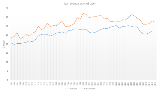
Data extracted on 18 Oct 2015 02:10 UTC (GMT) from OECD.Stat.
Interestingly, this faster growth in the New Zealand tax revenues as a percentage of GDP coincided with the two lost decades of New Zealand growth between 1974 and 1992. Furthermore, the chart below shows that an emerging recovery in labour productivity in the early 1980s stalled when tax revenues started growing again as a percentage of New Zealand GDP.
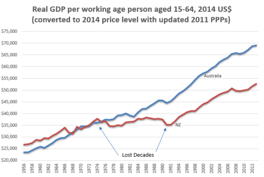
Source: Computed from OECD StatExtract and The Conference Board. 2015. The Conference Board Total Economy Database™, May 2015, http://www.conference-board.org/data/economydatabase/
Between 1974 and 1992, New Zealand lost 34% and productivity against trend of 1.9%. In the chart below, a flat line is growth at a rate equal to the trend rate of growth for the USA in the 20th century which is 1.9%. A falling line indicates growth at less than 1.9% for the year. A rising line means growth in excess of 1.9% for the year. The chart below confirms what the chart above says. Productivity stopped falling in the early 1980s then started falling rapidly at the same time that tax revenues spiked as percentage of GDP in the early 1980s.
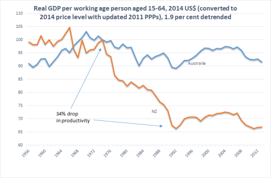
Source: Computed from OECD StatExtract and The Conference Board. 2015. The Conference Board Total Economy Database™, May 2015, http://www.conference-board.org/data/economydatabase/
in the above chart, Australia had pretty steady growth since about 1970. There is a productivity slowdown in the 1970s and above-average growth as the economy recovered from the Keating recession in the early 1990s. The so-called mining boom is hardly noticeable in Australia’s trend growth rate.


Recent Comments