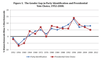
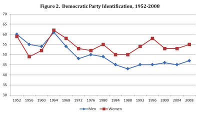
via http://www.mischiefsoffaction.com/2012/10/parties-and-gender-gap.html
Celebrating humanity's flourishing through the spread of capitalism and the rule of law
07 Feb 2015 Leave a comment
in politics - New Zealand, politics - USA, Public Choice Tags: voter demographics
06 Feb 2015 Leave a comment
in applied welfare economics, entrepreneurship, human capital, labour economics, occupational choice, politics - New Zealand, politics - USA Tags: activists, distributive justice, do gooders, expressive voting, Leftover Left, poverty and inequality, rational ignorance, rational irrationality, top 1%
05 Feb 2015 Leave a comment
05 Feb 2015 Leave a comment
in economic growth, economic history, politics - New Zealand Tags: geography, global economic hubs
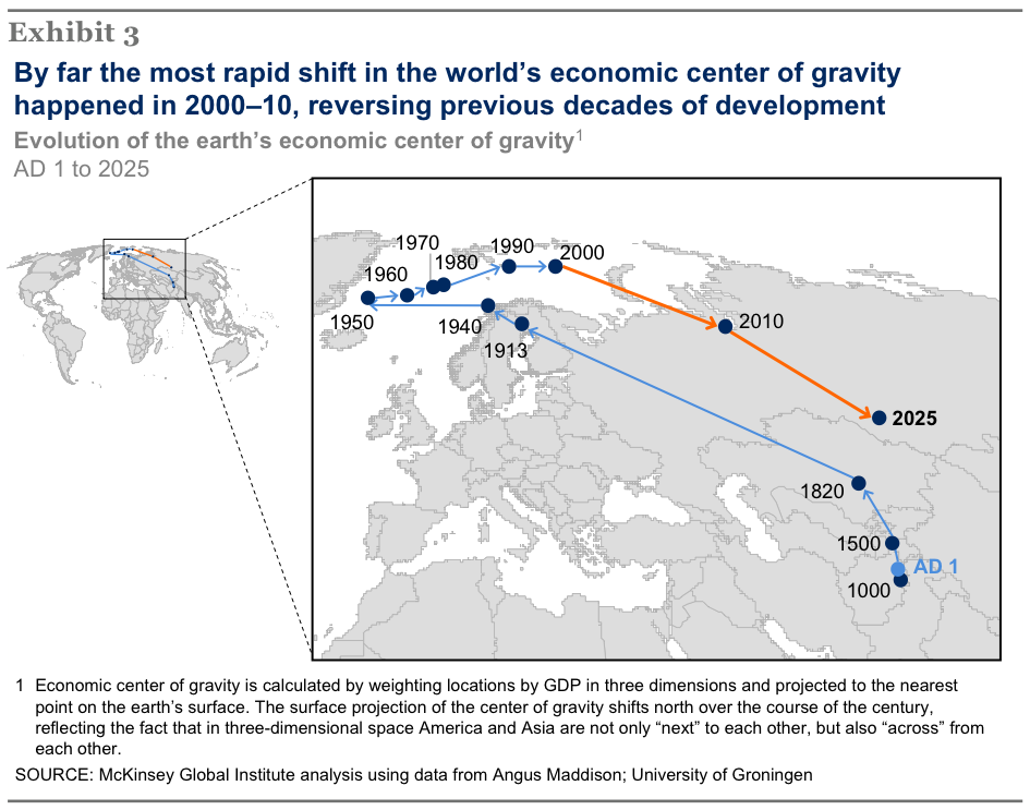
HT: https://twitter.com/tutor2u_econ/status/552013472247341056?s=09
05 Feb 2015 Leave a comment
in economics of information, politics - Australia, politics - New Zealand, politics - USA, Public Choice Tags: expressive voting, poverty and inequality, rational ignorance, rational irrationality, the top 1%, urban myths
03 Feb 2015 Leave a comment
in politics - New Zealand Tags: 2014 New Zealand election

HT: The Guardian
03 Feb 2015 Leave a comment
in climate change, economics of information, economics of media and culture, environmental economics, global warming, health economics, politics - Australia, politics - New Zealand, politics - USA, Public Choice Tags: anti-vaccination movement, climate alarmists, expressive politics, expressive voting, psychology of persuasion

In the last post, I presented evidence, collected as part of the CCP Vaccine Risk Perception study, that showed that the trope has no meaningful connection to fact.
Those who accept and reject human evolution, those who believe in and those who are skeptical about climate change, all overwhelmingly agree that vaccine risks are low and vaccine benefits high.
The idea that either climate change skepticism or disbelief in evolution denotes hostility to science or lack of comprehension of science is false, too. That’s something that a large number of social science studies show. The CCP Vaccine Risk study doesn’t add anything to that body of evidence.
Vaccination rates are a serious issue. Do those that are trying to lift vaccination rates think they going to get anywhere by calling people stupid, corrupt and in the pay of a multinational.
Of course not. This matter is serious. It’s a real public health risk.
People are persuaded to vaccinate through gentle messages providing facts in a way they can understand that also respects their knowledge, their intellect, and their concerns for the safety of the children. You don’t win people over by insulting them.
The climate alarmists are so insulting because they have no interest in persuading the people that are actually talking to. They are reaching out to members on the audience were are on the margin, and appealing to their political base, including the fundraising base by showing how staunch they are in slaying the Dragon.
03 Feb 2015 Leave a comment
in economics of media and culture, politics - Australia, politics - New Zealand, politics - USA Tags: activists, do gooders, expressive voting, Left-wing hypocrisy, occupy movement, superstar effect

Because the most-popular songs now stay on the charts for months, the relative value of a hit has exploded.
The top 1 percent of bands and solo artists now earn 77 percent of all revenue from recorded music, media researchers report. And even though the amount of digital music sold has surged, the 10 best-selling tracks command 82 percent more of the market than they did a decade ago.
The advent of do-it-yourself artists in the digital age may have grown music’s long tail, but its fat head keeps getting fatter.
The only explanation for the failure of the Twitter Left to protest against this concentration or of wealth and massive rise in ticket prices to the downtrodden young public that go to concerts is a mass kidnapping of the protesters in the Occupy Wall Street movement.

03 Feb 2015 Leave a comment
in health economics, politics - New Zealand, politics - USA Tags: anti-vaccination movement, measles
video link is https://www.youtube.com/watch?v=oAluTnnLyF4

Data is for the Auckland health board district.
03 Feb 2015 Leave a comment
in politics - Australia, politics - New Zealand, politics - USA, Public Choice, public economics Tags: capital gains tax, company tax, efficient taxes, optimal taxes
02 Feb 2015 Leave a comment
in economics of education, entrepreneurship, politics - New Zealand, politics - USA Tags: capitalism and freedom, Elizabeth Warren, School choice, The meaning of competition, vouchers

It is not a coincidence that Warren’s support for school choice dropped through the floor once she decided to run for public office as a Democrat. In spite of large cash infusions from wealthy environmentalists and trial lawyers, teacher unions remain the party’s largest and most influential donor base.
…In recent years, Warren has bent over backwards to qualify what she “really meant” by school choice.
In a rather astonishing reinterpretation of her own work, it turns out she never supported vouchers for religious school or even for non-sectarian private schools, just the ability to go to a public school in an adjacent district.
02 Feb 2015 Leave a comment
in applied price theory, applied welfare economics, economics of media and culture, economics of regulation, international economics, politics - New Zealand Tags: bootleggers and baptists, foreign direct investment, foreign investment, free trade, Index of Economic Freedom
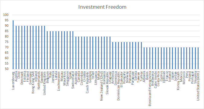
Source: 2015 Index of Economic Freedom
According to the Index of Economic Freedom 2015, in New Zealand
Foreign investment is welcomed, but the government may screen some large investments.
There was a major review of New Zealand foreign investment regulations about 10 years ago. The purpose of that review commissioned by the Labour government’s Minister of Finance, Dr Michael Cullen, was to deregulate the regulation of foreign investment in New Zealand.
At the time,under the Overseas Investment Act, the Minister of Finance could refuse permission to any investment. Australia’s current overseas investment regulations are the same. The federal treasurer may reject foreign investment proposals on the basis of an open-ended definition of national interest.
The last time that foreign investors had been refused permission to invest in New Zealand was in the early 1980s under then National Party Government Prime Minister Robert Muldoon. In a fit of pique, he refused permission to an Australian investor.
The revised foreign investment regulations limits the ability of government to reject foreign investors to narrow criteria such as the acquisition of sensitive land and large New Zealand companies. As part of this theme that foreign acquisitions of land was the main policy concern regarding foreign investment, the administration of the foreign investment regulations was moved out of a Overseas Investment Commission housed at the Reserve Bank of New Zealand to the very low key Land Information Office:
The Overseas Investment Office (OIO) assesses applications from overseas investors seeking to invest in sensitive New Zealand assets – being ‘sensitive’ land, high value businesses (worth more than $100 million) and fishing quota.
Naturally, subsequent to this genuine attempt by the Labour government of 10 years ago to deregulate foreign investment regulation, a number of investments have been refused since then often on the pretext that some part of the investment acquired sensitive coastal land door or rural land. The criteria for regulating foreign investment is as follows:
As regards the criteria relating to the relevant “overseas person”, the OIO needs to be satisfied that:
- the “overseas person” has demonstrated financial commitment to the investment; and
- the “overseas person” or (if that person is not an individual) the individuals with ownership and control of the overseas person (such as the shareholders and directors of the overseas purchaser):
- have the business experience and acumen relevant to that investment;
- are of good character; and
- are not prohibited from entering New Zealand by reason of sections 15 or 16 of the Immigration Act 2009 (e.g. persons who have been imprisoned for certain periods of time).
As regards the criteria relating to the particular investment, the OIO needs to be satisfied that the overseas investment will, or is likely to, benefit New Zealand (or any part of it or group of New Zealanders). When considering this, the OIO has a range of factors that it must consider (including, for example, whether the investment will create new job opportunities, introduce new technology or business skills, advance a significant Government policy or strategy, or bring other consequential benefits to New Zealand).
The New Zealand Initiative recently reviewed this criteria for regulating overseas investment into New Zealand and found that:
the report finds that the criteria for approval do not test the economic benefit to New Zealanders, where sensitive land is sold to an overseas person not intending to live in New Zealand indefinitely.
Indeed, the criteria are unambiguously hostile, even excluding the gain to a New Zealand vendor. This opens the way for the imposition of approval conditions that could impose net costs on New Zealanders given the regime’s potentially adverse effects on land values
The regulation of foreign investment in other countries is much more specific about what it is trying to achieve,as New Zealand Initiative also noted in its recent review:
New Zealand’s comprehensive screening regime accounts for our poor international ranking in the OECD’s FDI Regulatory Restrictiveness Index.
Most other countries focus their regimes more narrowly on national security considerations, often relating to particularly sensitive industries or sectors.
The main reason the public supports foreign investment regulation is because the public doesn’t like foreigners, and politicians pander to that xenophobia. If foreign investment is reduced, more of total investment spending has to be funded from domestic saving.

Access to foreign savings – trade in savings – allows investment to be made sooner, consumption to be smoothed over hiatuses such as recessions, and consumption to be bought forward in the light of better times such higher output and higher future incomes as because of foreign investment.The

The large national gains from foreign capital inflows is not part of that debate. A recent review of the gains from foreign capital inflows to New Zealanders found access to foreign saving led to national income per head, net of the servicing cost of foreign capital:
You can’t let facts bugger a good story.
The foreign investment is in response to the high returns in the local market and the inflow of foreign capital will continue until local rates of return match those in other countries. Equalisation of risk-adjusted rate of returns is central to the operation of capital markets.
Stopping this process of equalisation of returns on capital through regulation only benefits the capitalists inside the country because the curbing of foreign investment stops rates of return falling to those overseas. Foreign investment regulation reduces the wages of New Zealand workers because they have less capital and fewer modern technologies to work with.
Fortunately, local capitalists can work in league with economic populists on the left and the right and the anti-foreign bias of the voting public to make it more difficult for foreign investors to come to New Zealand and drive down the profits of New Zealand capitalists. Who gains from that? As Paul Krugman said:
The conflict among nations that so many policy intellectuals imagine prevails is an illusion; but it is an illusion that can destroy the reality of mutual gains from trade.
01 Feb 2015 Leave a comment
in applied price theory, politics - Australia, politics - New Zealand, politics - USA, transport economics Tags: activists, do gooders, free public transport, The fatal conceit, The pretence to knowledge

The earliest urban experiment in free public transit took place in Rome in the early 1970s. The city, plagued by unbearable traffic congestion, tried making its public buses free.
At first, many passengers were confused: “There must be a trick,” a 62-year-old Roman carpenter told The New York Times as he boarded one bus. Then riders grew irritable. One “woman commuter” predicted that “swarms of kids and mixed-up people will ride around all day just because it doesn’t cost anything.”
Romans couldn’t be bothered to ditch their cars—the buses were only half-full during the mid-day rush hour, “when hundreds of thousands battle their way home for a plate of spaghetti.” Six months after the failed, costly experiment, a cash-strapped Rome reinstated its fare system.
Three similar experiments in the U.S.—in Denver, Colorado, and Trenton, New Jersey, in the late 70s, and in Austin, Texas, around 1990—also proved unfruitful and shaped the way American policy makers viewed the question of free public transit.
All three were attempts to coax commuters out of their cars and onto subway platforms and buses. While they succeeded in increasing ridership, the new riders they brought in were people who were already walking or biking to work. For that reason, they were seen as failures.
A 2002 report released by the National Center for Transportation Research indicated that the lack of fares attracted hordes of young people, who brought with them a culture of vandalism, graffiti, and bad behavior—which all necessitated costly maintenance. The lure of “free,” the report implied, attracted the “wrong” crowd—the “right” crowd, of course, being wealthier people with cars, who aren’t very sensitive to price changes.

HT: http://m.theatlantic.com/business/archive/2015/01/why-cant-public-transit-be-free/384929/
Celebrating humanity's flourishing through the spread of capitalism and the rule of law
A History of the Alt-Right
Econ Prof at George Mason University, Economic Historian, Québécois
Celebrating humanity's flourishing through the spread of capitalism and the rule of law
Scholarly commentary on law, economics, and more
Beatrice Cherrier's blog
Celebrating humanity's flourishing through the spread of capitalism and the rule of law
Celebrating humanity's flourishing through the spread of capitalism and the rule of law
Celebrating humanity's flourishing through the spread of capitalism and the rule of law
Why Evolution is True is a blog written by Jerry Coyne, centered on evolution and biology but also dealing with diverse topics like politics, culture, and cats.
Celebrating humanity's flourishing through the spread of capitalism and the rule of law
A rural perspective with a blue tint by Ele Ludemann
DPF's Kiwiblog - Fomenting Happy Mischief since 2003
Celebrating humanity's flourishing through the spread of capitalism and the rule of law
The world's most viewed site on global warming and climate change
Tim Harding's writings on rationality, informal logic and skepticism
A window into Doc Freiberger's library
Let's examine hard decisions!
Commentary on monetary policy in the spirit of R. G. Hawtrey
Thoughts on public policy and the media
Celebrating humanity's flourishing through the spread of capitalism and the rule of law
Politics and the economy
A blog (primarily) on Canadian and Commonwealth political history and institutions
Reading between the lines, and underneath the hype.
Economics, and such stuff as dreams are made on
"The British constitution has always been puzzling, and always will be." --Queen Elizabeth II
Celebrating humanity's flourishing through the spread of capitalism and the rule of law
Celebrating humanity's flourishing through the spread of capitalism and the rule of law
WORLD WAR II, MUSIC, HISTORY, HOLOCAUST
Undisciplined scholar, recovering academic
Celebrating humanity's flourishing through the spread of capitalism and the rule of law
Res ipsa loquitur - The thing itself speaks
In Hume’s spirit, I will attempt to serve as an ambassador from my world of economics, and help in “finding topics of conversation fit for the entertainment of rational creatures.”
Researching the House of Commons, 1832-1868
Articles and research from the History of Parliament Trust
Reflections on books and art
Posts on the History of Law, Crime, and Justice
Celebrating humanity's flourishing through the spread of capitalism and the rule of law
Exploring the Monarchs of Europe
Cutting edge science you can dice with
Small Steps Toward A Much Better World
“We do not believe any group of men adequate enough or wise enough to operate without scrutiny or without criticism. We know that the only way to avoid error is to detect it, that the only way to detect it is to be free to inquire. We know that in secrecy error undetected will flourish and subvert”. - J Robert Oppenheimer.
The truth about the great wind power fraud - we're not here to debate the wind industry, we're here to destroy it.
Celebrating humanity's flourishing through the spread of capitalism and the rule of law
Celebrating humanity's flourishing through the spread of capitalism and the rule of law


Recent Comments