The rise in articles about inequality in NZ sure doesn't match the data on inequality.
youtube.com/watch?v=uCT7aE… http://t.co/z2eWKgXJiL—
Eric Crampton (@EricCrampton) June 26, 2015
More heat than light in the recent inequality debate
26 Jun 2015 1 Comment
"You didn’t build that" – which of sport superstars, celebrities and top CEOs earn their pay more?
25 Jun 2015 Leave a comment
in applied price theory, applied welfare economics, entrepreneurship, financial economics, industrial organisation, Marxist economics, politics - New Zealand, politics - USA, rentseeking, sports economics, survivor principle Tags: CEO pay, Leftover Left, obama, superstar wages, superstars, top 1%
Defenders have also pointed to the pay of pro ballplayers or Hollywood stars, but they do not determine their own pay (as CEOs do) and are paid based on performance. Once they begin to fail, they are dumped. By contrast, CEO pay isn’t tied to performance in any meaningful way.
It’s a big concession to say that athletes and celebrities earn their pay but top CEOs don’t. Most of all, that concession changes the case against the top 1% from inequality to just desert – a big shift in theories of distributive justice. It’s also a big risk to base the argument for greater equality and a 80% top tax rate not only on the excesses of CEOs but on the very specific and testable hypothesis that these CEOs determine their own pay.
if we are to look at CEOs, top athletes and Hollywood celebrities, it is the athletes and celebrities who benefited the most from the windfall of been able to service huge markets through the global media market.
Figure 1: CEO pay and share market performance
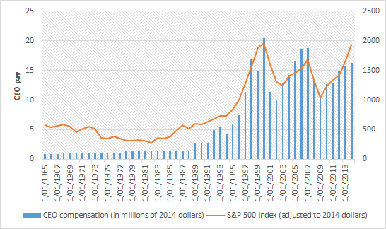
Source: Economic Policy Institute.
CEOs actually have to run large complex companies to earn their pay, which is why their compensation tracks the share market relatively closely. Athletes and celebrities don’t do that what they do any better than in the past. They simply do it in front of a global media market. Since the late 1970s, the ratio of average pay of CEOs of large public companies to the average market value of those companies has stayed relatively constant: CEO pay grew hand in hand with corporations.
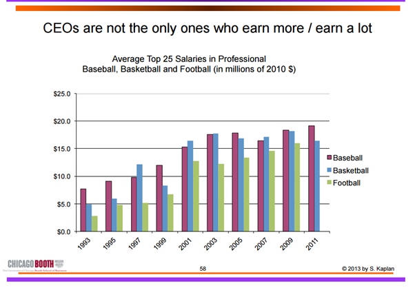
Steven Kaplan and Joshua Rauh make a number of basic points backed up by detailed evidence about CEO pay:
- While top CEO pay has increased, so has the pay of private company executives and hedge fund and private equity investors;
- ICT advances increase the pay of many – of professional athletes (technology increases their marginal product by allowing them to reach more consumers), Wall Street investors (technology allows them to acquire information and trade large amounts more easily), CEOs and technology entrepreneurs in the Forbes 400; and
- Technology allows top executives and financiers to manage larger organizations and asset pools – a loosening of social norms and a lack of independent control of CEO pacesetting does not explain similar increases in pay for private companies– technology explains it;
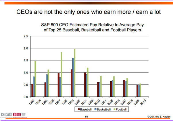
To put it simply:
If the reason for growth of incomes at the very top is, say, managerial power in publicly owned companies, then one would expect the increases in income at the top levels to be much larger for that group.
But the breadth of the occupations that have seen a rise in top income levels is much more consistent with the argument that the increase in “superstar” pay (or pay at the top) has been driven by the growth of information and communications technology, and the ways this technology allows individuals with particular skills that are in high demand to expand the scale of their performance.
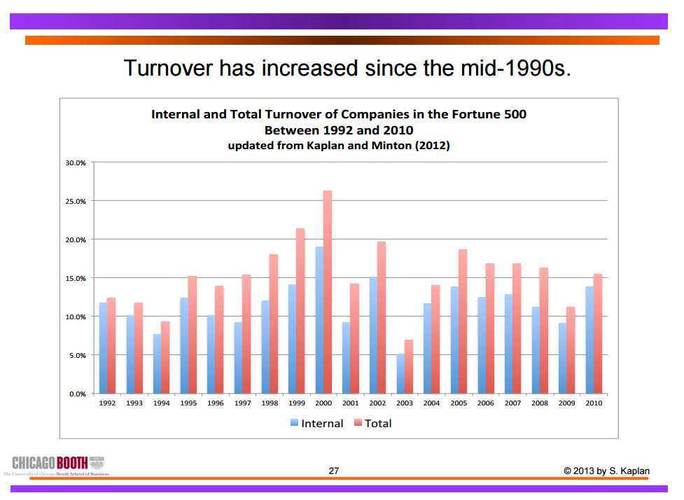
As for the turnover argument, that underperforming athletes and celebrities are dropped, prior to the GFC, CEO turnover was already on the rise:
Turnover is 14.9% from 1992 to 2005, implying an average tenure as CEO of less than seven years. In the more recent period since 1998, total CEO turnover increases to 16.5%, implying an average tenure of just over six years.
Internal turnover is significantly related to three components of firm performance – performance relative to industry, industry performance relative to the overall market, and the performance of the overall stock market.
Only 21.3% of CEOs in 1992 remained in that role in 1999; only 16.35% of CEOS on the job in 2000 were there in 2007. In any given year, one out of six Fortune 500 CEOs loses their jobs, compared to one out of 10 in the 1970s.
Dirk Jenter and Fadi Kanaan in a study of of 3,365 CEO turnovers from 1993 to 2009 found that:
CEOs are significantly more likely to be dismissed from their jobs after bad industry and, to a lesser extent, after bad market performance. A decline in industry performance from the 90th to the 10thpercentile doubles the probability of a forced CEO turnover.
In another study, Kaplan found that average CEO pay increased substantially during the 1990s, but declined by more than 30% from peak levels reached around 2000.
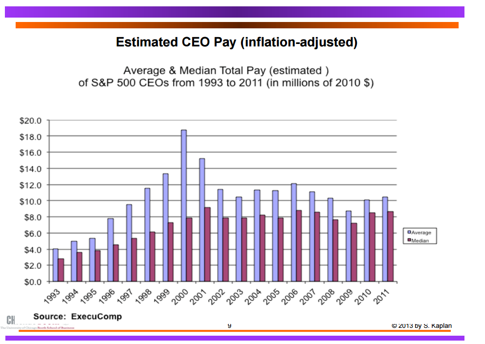
In addition, private company executives have seen their pay increase by at least as much as public companies. Private company executives with fewer agency problems have increased by more than public company executives. To close with another quote from Kaplan:
The point of these comparisons is to confirm that while public company CEOs earn a great deal, they are not unique. Other groups with similar backgrounds–private company executives, corporate lawyers, hedge fund investors, private equity investors and others—have seen significant pay increases where there is a competitive market for talent and managerial power problems are absent.
Again, if one uses evidence of higher CEO pay as evidence of managerial power or capture, one must also explain why these professional groups have had a similar or even higher growth in pay. It seems more likely that a meaningful portion of the increase in CEO pay has been driven by market forces as well.
@MaxRashbrooke The top 1% in New Zealand are lazy and incompetent as a ruling class
24 Jun 2015 1 Comment
in applied price theory, applied welfare economics, economic history, entrepreneurship, health and safety, human capital, industrial organisation, liberalism, Marxist economics, poverty and inequality, Rawls and Nozick, unions Tags: capitalism and freedom, Class war, Joan Robinson, Joseph Schumpeter, social insurance, The Great Enrichment, top 1%, welfare state, withering away in the proletariat
New work by Chris Ball and John Creedy shows substantial *declines* in NZ inequality.
initiativeblog.com/2015/06/24/ine… http://t.co/f94fw4Bhae—
Eric Crampton (@EricCrampton) June 24, 2015
The top 1% in New Zealand really have been dropping the class war ball for at least a generation.
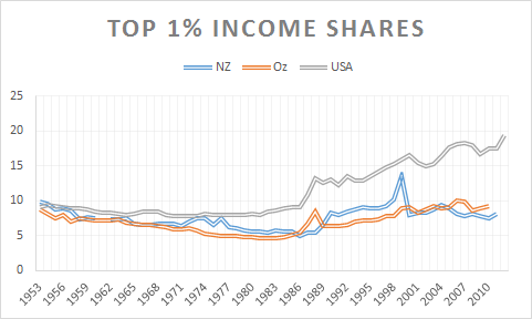
Source: The World Top Incomes Database.
Not only have the New Zealand top 1% been pretty miserable at increasing their share of incomes, hardly any change since 1990 and not much before that, the top 1% allowed inequality in both consumption and disposable income to actually fall since 1990 as shown by Treasury analysis published today.
Joan Robinson was on to this in the 1940s when she said the battle cry of Marxists would have to change from the 1848 version “rise up ye workers, rise up for you have nothing to lose but your chains” to “rise up ye workers, rise up for you have nothing to lose but the prospect of a suburban home and a motorcar”.

Today that battle cry of the Marxist revolution would have to be “rise up ye workers rise up for you have nothing to lose but your iPhone and your air points”. As Joan Robinson observed in the 1940s, that’s not much of a basis for a revolutionary movement.
The Quantity and Quality of Japanese, Singaporean and Hong Kong Lives, 1965 to 1995
23 Jun 2015 Leave a comment
in applied welfare economics, development economics, economic history, Gary Becker, growth miracles Tags: Hong Kong The Great Escape, Japan, life expectancy is, Singapore, The Great Enrichment, The Great Fact
Figure 1: increase in real GDP and increase in real GDP plus life expectancy GDP increase equivalent, Japan, Singapore and Hong Kong, 1965 to 1995
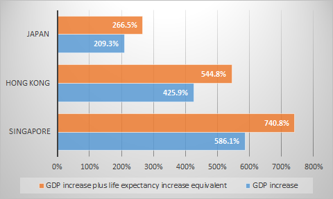
GDP per capita is usually used to proxy for the quality of life of individuals living in different countries. Becker and his co-authors computed a "full" growth rate that incorporates the gains in health and life expectancy.
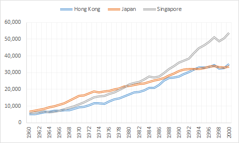
Figure 2 shows that Japan, Hong Kong and Singapore started from similar levels of real GDP per capita PPP in 1960.
Figure 2: GDP per capita in 2014 US$ (converted to 2014 price level with updated 2011 PPPs), Hong Kong, Japan and Singapore, 1960 – 2000
Source: The Conference Board. 2015. The Conference Board Total Economy Database™, May 2015, http://www.conference-board.org/data/economydatabase/
The opportunity cost of renewable energy subsidies
22 Jun 2015 Leave a comment
in applied price theory, applied welfare economics, development economics, environmental economics, global warming, health economics, Public Choice, rentseeking Tags: climate alarmism, evidence-based policy, global warming, green rent seeking
The Quantity and Quality of Australian, New Zealand, Canadian, American and English & Welsh Lives, 1965 to 1995
21 Jun 2015 Leave a comment
in applied welfare economics, economic history, Gary Becker, politics - Australia, politics - New Zealand, politics - USA, population economics, technological progress Tags: Australia, British economy, Canada, life expectancy, lost decades, New Zealand, The Great Enrichment
Figure 1: increase in real GDP and increase in real GDP plus life expectancy GDP increase equivalent, Australia, New Zealand, Canada, USA and England & Wales, 1965 to 1995
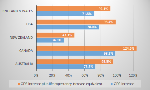
GDP per capita is usually used to proxy for the quality of life of individuals living in different countries. Becker and his co-authors computed a "full" growth rate that incorporates the gains in health and life expectancy.
Figure 1 shows that New Zealand was way behind the other countries in improvements in the quantity and quality of life between 1965 and 1995. This brings new meaning to the two decades of lost growth between 1973 and 1995. Canada should refer to 1965 to 1995 as its golden era.
Would you rather make $50,000 in today’s New Zealand or $100,000 in the 1980s before neo-liberalism?
21 Jun 2015 1 Comment
in applied welfare economics, economic history, politics - New Zealand, population economics, technological progress Tags: good old days, left-wing fantasies, Leftover Left, life expectancies, neoliberalism, The Great Enrichment, time machine, welfare state
Ezra Klein and Matt O’Brien posed an interesting variation of Brad De Long’s Time Machine question. O’Brien asked:
Try this thought experiment. Adjusted for inflation, would you rather make $50,000 in today’s world or $100,000 in 1980’s? In other words, is an extra $50,000 enough to get you to give up the internet and TV and computer that you have now? The answer isn’t obvious.
And if $100,000 isn’t enough, what would be? $200,000? More? This might be the best way to get a sense of how much better technology has made our lives—not to mention the fact that people are living longer—the past 35 years, but the problem is it’s particular to you and your tastes. It’s not easy to generalize.
This doesn’t mean, though, that the middle class is doing well or even as well as it should be. Just that it’s doing better than the official numbers say it is.
Let them have iPhones is the new let them eat cake.
The same questions are asked in New Zealand in a different way when people go on about how much more unequal New Zealand is compared to the 1980s and how bad things have got because of that rise in inequality.
Would it better to be on the welfare benefit in the 1980s than on a benefit today in a less equal New Zealand than in the 1980s? It is certainly the case that the Gini coefficient is worse than it was in the 1980s – see figure 1.
Figure 1: Gini coefficient New Zealand 1980-2015
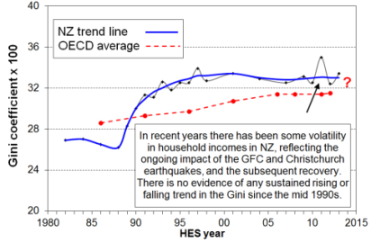
Source: Bryan Perry, Household incomes in New Zealand: Trends in indicators of inequality and hardship 1982 to 2013. Ministry of Social Development (July 2014).
But household incomes on a real basis increased across the border in New Zealand – see figure 2 – including for Maori and Pasifika. As shown in figure 2 below, between 1994 and 2010, real equivalised median New Zealand household income rose by 47%; for Māori, this rise was 68%; for Pasifika, the rise in real equivalised median household income was 77%.
Figure 2: Real equivalised median household income (before housing costs) by ethnicity, 1988 to 2013 ($2013)
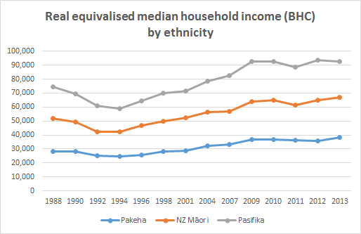
Source: Bryan Perry, Household incomes in New Zealand: Trends in indicators of inequality and hardship 1982 to 2013. Ministry of Social Development (July 2014).
The biggest worry for anyone longing to be on a welfare benefit or to be otherwise working back in the good old days in the 1980s on the more equal incomes of back then is instant death.

Stepping into that Time Machine to go back to the more equal, more egalitarian 1980s shaves about five years off your life expectancy, if not more! Death certainly is the great leveller when it comes to Left over Left fantasies about the good old days before the economic reforms of the 1980s. Indeed, the 1980s was a period where life expectancies started to increase again after a hiatus in the 1960s and 1970s.

Time travel back to the good old days in the 1980s before neoliberalism would be particularly grim from Maori because of their much lower life expectancies of Maori back in the 1980s – see figure 3.
Figure 3: Life expectancy at birth, Maori and non-Maori by sex
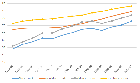
Source: Statistics New Zealand.
The most apt summary of how bad it was in the 1980s compared to today is by veteran left-wing grumbler Max Rashbrooke. To paint pre-1984 New Zealand, pre-neoliberal New Zealand as an egalitarian paradise, he had to ignore the economic progress of two thirds of the population and the inequalities they suffered:
New Zealand up until the 1980s was fairly egalitarian, apart from Maori and women, our increasing income gap started in the late 1980s and early 1990s.
Many forget how expensive the moon program was in the 60s and that it wasn’t popular!
18 Jun 2015 Leave a comment
in applied welfare economics, economic history, politics - USA Tags: expressive voting, moon, NASA, public R&D, R&D, space program
NASA's budget as a percentage of Federal spending. Wish this chart went up. =( buff.ly/1FygxQ7 http://t.co/dEczs1QNoi—
Tyler Vigen (@TylerVigen) May 26, 2015
…many people believe that Project Apollo was popular, probably because it garnered significant media attention, but the polls do not support a contention that Americans embraced the lunar landing mission.
Consistently throughout the 1960s a majority of Americans did not believe Apollo was worth the cost, with the one exception to this a poll taken at the time of the Apollo 11 lunar landing in July 1969.
And consistently throughout the decade 45-60 percent of Americans believed that the government was spending too much on space, indicative of a lack of commitment to the spaceflight agenda. These data do not support a contention that most people approved of Apollo and thought it important to explore space.
HT: Moondoggle: The Forgotten Opposition to the Apollo Program – The Atlantic.
The difference between tariffs and quotas
18 Jun 2015 Leave a comment
in applied price theory, applied welfare economics, industrial organisation, international economics Tags: antimarket bias, import competition, international trade, protectionism, quotas, tariffs
What’s the difference between #tariffs and #quotas? Let’s find out buff.ly/1FS7QkZ http://t.co/hsx2VVG5e6—
MRUniversity (@MRevUniversity) May 30, 2015
The opportunity cost of expressive politics: fossil fuels disinvestment versus actually doing something that might help
17 Jun 2015 Leave a comment
in applied price theory, applied welfare economics, comparative institutional analysis, environmental economics, global warming, politics - Australia, politics - New Zealand, politics - USA, Public Choice, rentseeking Tags: cap and trade, carbon tax, carbon trading, climate alarmism, expressive voting, fossil fuel disinvestment, global warming, rational irrationality, Robert Stavins

Mises on the dangers of specialisation and economic analysis
17 Jun 2015 Leave a comment
in applied price theory, applied welfare economics, comparative institutional analysis, constitutional political economy, Ludwig von Mises Tags: division of labour, methodology of economics, philosophy of economics, The fatal conceit, The pretence to knowledge
Why do these top 0.1 percenters get a pass from the Occupied Movement and Twitter Left?
15 Jun 2015 Leave a comment
in applied welfare economics, economics of media and culture, income redistribution, movies, politics - USA, poverty and inequality, Public Choice, TV shows Tags: comedy, Left-wing hypocrisy, Leftover Left, Occupy Wall Street, top 1%, Twitter left
The 25 richest comedians (or why not to go into standup comedy) from @randal_olson randalolson.com/2015/03/04/top… http://t.co/cp3lSnuPOf—
Tyler Vigen (@TylerVigen) March 17, 2015
Mises on why economics analysis is so unpopular
14 Jun 2015 Leave a comment
in applied price theory, applied welfare economics, comparative institutional analysis, constitutional political economy, economics of bureaucracy, income redistribution, Ludwig von Mises, Public Choice, rentseeking Tags: antiforeign bias, antimarket bias, expressive voting, green rent seeking, makework bias, NIMBYs, rational ignorance, rational irrationality
Milton Friedman on the essence of the Age of the Worker
13 Jun 2015 Leave a comment
in applied price theory, applied welfare economics, economic growth, economic history, health and safety, income redistribution, industrial organisation, labour economics, labour supply, macroeconomics, Milton Friedman, occupational choice, politics - Australia, politics - New Zealand, politics - USA, Public Choice, rentseeking, unions Tags: competition and monopoly, The Great Enrichment, union power, union wage premium
Supplements to wages and salaries have grown dramatically, but labour compensation inequality has not
12 Jun 2015 Leave a comment
in applied price theory, applied welfare economics, politics - Australia, politics - New Zealand, politics - USA Tags: Leftover Left, Piketty, top 1%
Gross Domestic Income (GDI) is a complete measure of all income earned in the United States. About half is wages, salaries, and benefits. A quarter goes to business-level taxes and the replacement of worn out machinery. Another quarter of gross domestic income is returned to owners of capital, including business owners and private homeowners.
The shares of income returned to workers and owners of capital remain constant over time once benefits, taxes, and depreciation are accounted for – two-thirds of net income goes to labour and one-third goes to capital.
Rather than focus on shares of GDP, a recent preoccupation of the Left over Left, we should focus on shares of labour compensation, that is, wages, salaries and fringe benefits. Both Piketty and his critics agree on that.

via A Walkthrough of Gross Domestic Income | Tax Foundation.


Recent Comments