On 12 August last, Closer Together New Zealand posted a chart showing average hourly wages had been stagnant for 20 years and then started growing again in 1993. Closer Together New Zealand then rounded up the usual suspects of the Left over Left.
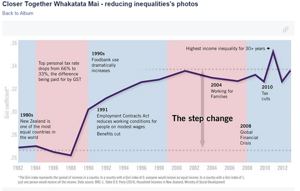
Later that month in a comment on that post, a chart was posted showing that inequality had been increasing quite rapidly in the late 1980s and early 1990s in New Zealand. There were a range of economic reforms Closer Together New Zealand didn’t like in the late 1980s and early 1990s.
Closer Together New Zealand did not notice their second chart showed there had been a large increase in inequality, and their first chart showed that this was followed by the return of regular average hourly wages after 20 years of stagnation.
I am not so vulgar as to suggest correlation is causation, but it is amusing to watch that one day a chart is posted showing a resumption of wages growth after 20 years of wage stagnation and the next day a chart is posted showing that the major economic developments in the preceding years were a large increase in inequality and substantial economic liberalisation.
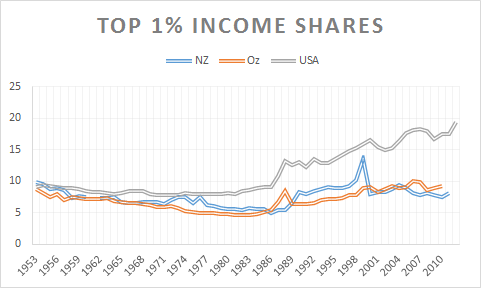
To add to my amusement, a companion site Inequality A New Zealand Conversation posted a chart showing the top 1% had not had much at all in income growth for the last 20 years while most everyone else had. This spike in the incomes of the top 1% prior to about 1994 was followed by the resumption in average wages growth after 1994.
In a system where income goes disproportionately to the already well-off, ordinary workers are missing out on the rewards of their efforts, to the tune of billions of dollars a year. Welfare benefits, cut by a quarter in 1991 and increased just 8 per cent in the last budget, are far too low to meet people’s basic needs.
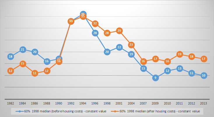
The result is a doubling of child poverty and the return of childhood diseases unknown in most developed countries – a national embarrassment, as one researcher described it.
Figure 1: % child poverty in New Zealand (before and after housing costs), 60% 1998 median constant value, 1982 – 2013
Source: Bryan Perry, Household incomes in New Zealand: Trends in indicators of inequality and hardship 1982 to 2013. Ministry of Social Development (July 2014), Tables F.6 and F.7.
The only thing noticeable in the downward trend in child poverty in New Zealand since its doubling with the sharp recession in 1990 with double-digit unemployment rates is child poverty stop falling shortly after in-work family tax credits were introduced in the form of Working for Families in 2005.
New QV figures show Auckland house prices are up a massive 16.1% on last year, now estimated to reach $1m by Aug '16. http://t.co/DwAU79ozCy— New Zealand Labour (@nzlabour) June 09, 2015
There was a break in trend in the long decline in child poverty as soon as in-work family tax credits were introduced in New Zealand. I’m sure this is a coincidence because, as Brian Perry said when discussing the introduction of Working for Families in 2005:
The 2004 to 2007 period was the only one in the 25 years to 2007 in which the incomes of low- to middle-income households grew more quickly than those of households above the median.
The real killer in New Zealand in terms of poverty and inequality are housing costs. Housing costs are wholly under the control of government through its control of the supply of land, which is restricted at the behest of the parties of the left.
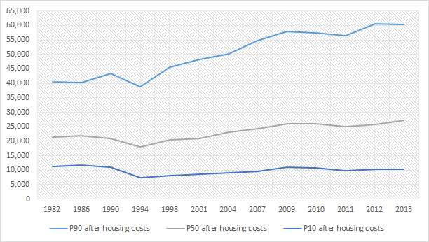
Figure 2: real equivalised household incomes (before and after housing costs): changes at the top of lowest income decile, New Zealand, 1982 to 2013
Source: Bryan Perry, Household incomes in New Zealand: Trends in indicators of inequality and hardship 1982 to 2013. Ministry of Social Development (July 2014), tables D.2 and D.4.
Figure 2 shows that real equivalised household income after housing costs has not grown and in fact has fallen for the bottom 10% of the income distribution in New Zealand.
It is the left-wing parties who oppose measures to reduce housing costs and and increase the supply of land through reforms to the Resource Management Act and the relaxation of the Auckland metropolitan urban limit.
Labour and the Greens are in effect keeping the poor poor to win middle-class votes.
Figure 3: real equivalised household incomes (before and after housing costs): changes at the top of the top, middle and lowest lowest income deciles, New Zealand, 1982 to 2013
Source: Bryan Perry, Household incomes in New Zealand: Trends in indicators of inequality and hardship 1982 to 2013. Ministry of Social Development (July 2014), tables D.2 in D.4.
Figure 3 shows that those in the middle and higher deciles, a political territory rich in swinging voters, are still doing well after housing costs. The parties of the left are collaborating with a middle-class home owning voter while betraying the working class and its aspirations from home ownership and quite simply affordable housing costs when they rent.
The increases for all groups may be understated by the inability of living standards measures to adequately account for new goods, product upgrades and rising life expectancies.
Don’t these graphs show that everyone is richer in New Zealand than 30 years ago and there has been not much change in either child poverty or inequality for coming on for 20 years? The fall in child poverty started before the introduction of Working for Families.
Technological progress in the form of new goods and product upgrades are poorly captured in measures of living standards over time as is increases in life expectancies.
The top 0.1% in Australia is earning not much more than it did in 1946. For most of the post-war period, the Australian top 0.1% earned less than what it earned in 1946. The only spike in the earnings of the Australian top 0.1% occurred after the top tax rate of 66% was reduced to 49% in 1986.
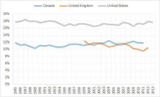
There were major cuts in the top tax rates in Australia,the USA and UK in the early 1980s. Figure 1 shows that these top tax rate cuts were matched with a spike in the earnings of the top 0.1% subsequent to those large tax cuts.
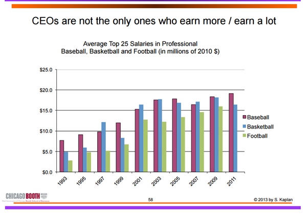
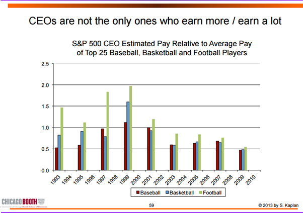
Defenders have also pointed to the pay of pro ballplayers or Hollywood stars, but they do not determine their own pay (as CEOs do) and are paid based on performance. Once they begin to fail, they are dumped. By contrast, CEO pay isn’t tied to performance in any meaningful way.
It’s a big concession to say that athletes and celebrities earn their pay but top CEOs don’t. Most of all, that concession changes the case against the top 1% from inequality to just desert – a big shift in theories of distributive justice. It’s also a big risk to base the argument for greater equality and a 80% top tax rate not only on the excesses of CEOs but on the very specific and testable hypothesis that these CEOs determine their own pay.
if we are to look at CEOs, top athletes and Hollywood celebrities, it is the athletes and celebrities who benefited the most from the windfall of been able to service huge markets through the global media market.
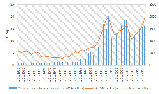
CEOs actually have to run large complex companies to earn their pay, which is why their compensation tracks the share market relatively closely. Athletes and celebrities don’t do that what they do any better than in the past. They simply do it in front of a global media market. Since the late 1970s, the ratio of average pay of CEOs of large public companies to the average market value of those companies has stayed relatively constant: CEO pay grew hand in hand with corporations.
While top CEO pay has increased, so has the pay of private company executives and hedge fund and private equity investors;
ICT advances increase the pay of many – of professional athletes (technology increases their marginal product by allowing them to reach more consumers), Wall Street investors (technology allows them to acquire information and trade large amounts more easily), CEOs and technology entrepreneurs in the Forbes 400; and
Technology allows top executives and financiers to manage larger organizations and asset pools – a loosening of social norms and a lack of independent control of CEO pacesetting does not explain similar increases in pay for private companies– technology explains it;
If the reason for growth of incomes at the very top is, say, managerial power in publicly owned companies, then one would expect the increases in income at the top levels to be much larger for that group.
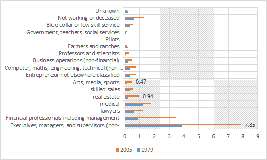
But the breadth of the occupations that have seen a rise in top income levels is much more consistent with the argument that the increase in “superstar” pay (or pay at the top) has been driven by the growth of information and communications technology, and the ways this technology allows individuals with particular skills that are in high demand to expand the scale of their performance.
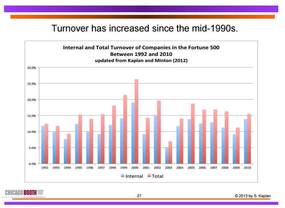
As for the turnover argument, that underperforming athletes and celebrities are dropped, prior to the GFC, CEO turnover was already on the rise:
Turnover is 14.9% from 1992 to 2005, implying an average tenure as CEO of less than seven years. In the more recent period since 1998, total CEO turnover increases to 16.5%, implying an average tenure of just over six years.
Internal turnover is significantly related to three components of firm performance – performance relative to industry, industry performance relative to the overall market, and the performance of the overall stock market.
Only 21.3% of CEOs in 1992 remained in that role in 1999; only 16.35% of CEOS on the job in 2000 were there in 2007. In any given year, one out of six Fortune 500 CEOs loses their jobs, compared to one out of 10 in the 1970s.
CEOs are significantly more likely to be dismissed from their jobs after bad industry and, to a lesser extent, after bad market performance. A decline in industry performance from the 90th to the 10thpercentile doubles the probability of a forced CEO turnover.
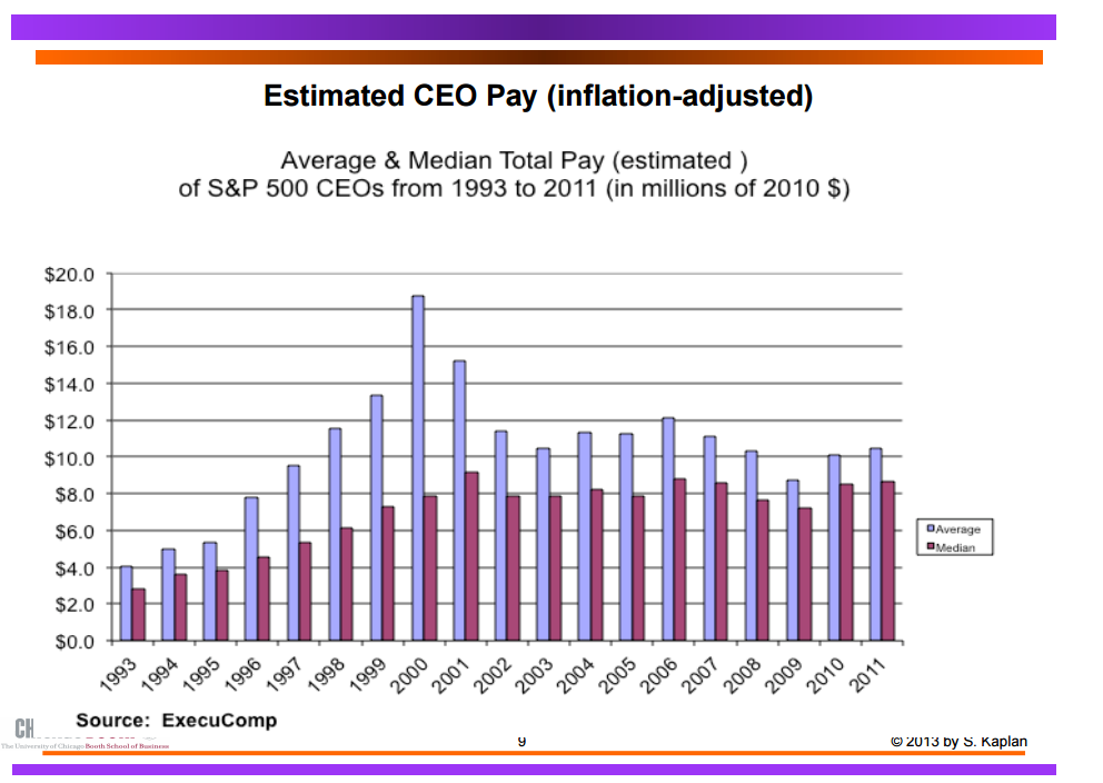
In another study, Kaplan found that average CEO pay increased substantially during the 1990s, but declined by more than 30% from peak levels reached around 2000.
In addition, private company executives have seen their pay increase by at least as much as public companies. Private company executives with fewer agency problems have increased by more than public company executives. To close with another quote from Kaplan:
The point of these comparisons is to confirm that while public company CEOs earn a great deal, they are not unique. Other groups with similar backgrounds–private company executives, corporate lawyers, hedge fund investors, private equity investors and others—have seen significant pay increases where there is a competitive market for talent and managerial power problems are absent.
Again, if one uses evidence of higher CEO pay as evidence of managerial power or capture, one must also explain why these professional groups have had a similar or even higher growth in pay. It seems more likely that a meaningful portion of the increase in CEO pay has been driven by market forces as well.
Not only have the New Zealand top 1% been pretty miserable at increasing their share of incomes, hardly any change since 1990 and not much before that, the top 1% allowed inequality in both consumption and disposable income to actually fall since 1990 as shown by Treasury analysis published today.
Joan Robinson was on to this in the 1940s when she said the battle cry of Marxists would have to change from the 1848 version “rise up ye workers, rise up for you have nothing to lose but your chains” to “rise up ye workers, rise up for you have nothing to lose but the prospect of a suburban home and a motorcar”.
Today that battle cry of the Marxist revolution would have to be “rise up ye workers rise up for you have nothing to lose but your iPhone and your air points”. As Joan Robinson observed in the 1940s, that’s not much of a basis for a revolutionary movement.
Cristiano Ronaldo moved from Manchester United to Real Madrid in 2009 partly to avoid the announced 50% top marginal income tax in the UK to benefit from “Beckham Law” in Spain. Beckham’s Law was a preferential tax scheme of 24% on foreign residents in Spain. When David Beckham transferred to Real Madrid, the manager of Arsenal football club commented that the supremacy of British soccer was at risk unless the U.K.’s top marginal tax rate changed.
A number of EU member states offer substantially lower tax rates to immigrant football players, including Denmark (1991), Belgium (2002) and Spain (2004). Beckham’s law had a big impact in Spain:
…when Spain introduced the Beckham Law in 2004, the fraction of foreigners in the Spanish league immediately and sharply started to diverge from the fraction of foreigners in the comparable Italian league.
Moreover, exploiting the specific eligibility rules in the Beckham Law, we show that the extra influx of foreigners in Spain is driven entirely by players eligible for the scheme with no effect on ineligible players.
Suez also found evidence from tax reforms in all 14 countries that the location decisions of players are very responsive to tax rates. Suez in another paper with Thomas Piketty wants the top tax rate to be 80%. However, their work on taxation and the labour supply supports a much lower rate:
First, higher top tax rates may discourage work effort and business creation among the most talented – the so-called supply-side effect. In this scenario, lower top tax rates would lead to more economic activity by the rich and hence more economic growth. If all the correlation of top income shares and top tax rates documented on Figure 1 were due to such supply-side effects, the revenue-maximising top tax rate would be 57%.
Suez and Piketty then go on to argue that the pay of chief executives of public companies, a subset of the top 1% and top 0.1%, may not reflect their productivity but that is a much more complicated argument about agency costs and the separation of ownership and control which they make rather weakly.
Much of their other work on top incomes is about the emergence of a working rich whose top incomes are wages earned by holding superstar jobs in a global economy. It would be peculiar and perhaps overzealous to organise the entire taxation of high incomes around the correction of agency costs arising from the separation of ownership and control of some of the companies listed on the stock exchange.
Figure 1: Percentage of national income (including capital gains) received by top 1%, and each primary taxpayer occupation in top 1%, USA
The 1950s was the era of the 90 percent top marginal tax rate, and by the end of that decade live gate receipts for top championship fights were supplemented by the proceeds from closed circuit telecasts to movie theatres.
A second fight in one tax year would yield very little additional income, hardly worth the risk of losing the title. And so, the three fights between Floyd Patterson and Ingemar Johansson stretched over three years (1959-1961); the two between Patterson and Sonny Liston over two years (1962-1963), as was also true for the two bouts between Liston and Cassius Clay (Muhammad Ali) (1964-1965).
Then, the Tax Reform Act of 1964 cut the top marginal tax rate to 70 percent effective in 1965. The result: two heavyweight title fights in 1965, and five in 1966. You can look it up.
Ufuk Akcigit, Salome Baslandze, and Stefanie Stantcheva studied the international migration responses of superstar inventors to top income tax rates for the period 1977-2003 using data from the European and US Patent offices.
our results suggest that, given a ten percentage point decrease in top tax rates, the average country would be able to retain 1% more domestic superstar inventors and attract 38% more foreign superstar inventors.
Emmanuel Saez and co-authors also found that a preferential top tax scheme for high earning migrants in their first three years in Denmark was highly successful in attracting highly skilled labour to that country:
…the number of foreigners in Denmark paid above the eligibility threshold (that is the group affected by the tax scheme) doubles relative to the number of foreigners paid slightly below the threshold (those are comparison groups not affected by the tax scheme) after the scheme is introduced.
This effect builds up in the first five years of the scheme and remains stable afterwards. As a result, the fraction of foreigners in the top 0.5% of the earnings distribution is 7.5% in recent years compared to a 4% counterfactual absent the scheme.
This very large behavioural response implies that the resulting revenue-maximising tax rate for a scheme targeting highly paid foreigners is relatively small (about 35%). This corresponds roughly to the current tax rate on foreigners in Denmark under the scheme once we account for other relevant taxes (VAT and excises).
This blog post was motivated by a courageous tweet about Tony Atkinson saying that increases in the top tax rate have little effect on the supply of labour! Not so.
"There is considerable evidence that marginal tax rates could rise somewhat without causing disincentive to work." http://t.co/vPhili6mvS
Why Evolution is True is a blog written by Jerry Coyne, centered on evolution and biology but also dealing with diverse topics like politics, culture, and cats.
In Hume’s spirit, I will attempt to serve as an ambassador from my world of economics, and help in “finding topics of conversation fit for the entertainment of rational creatures.”








Recent Comments