Unemployment isn’t much of an issue for the well educated in recessions

The sick men of Europe? British and Irish unemployment rates, 1956–2013

image

Source: OECD StatExtract

Ireland and Britain justly earned the name the sick man of Europe in the 1980s. Irish unemployment was  in the mid teens much of the 1980s because the Irish economy was in a great depression  from 1973 to 1992.

Unemployed people are defined as those who report that they are without work, that they are available for work and that they have taken active steps to find work in the last four weeks. The ILO Guidelines specify what actions count as active steps to find work; these include answering vacancy notices, visiting factories, construction sites and other places of work, and placing advertisements in the press as well as registering with labour offices.

Two booms, two depressions: British and Irish real GDP detrended, 1955–2013

Figure 1: Real GDP per British and Irish aged 15-64, converted to 2013 price level with updated 2005 EKS purchasing power parities, 1955-2013

image

Source: Computed from OECD Stat Extract and The Conference Board, Total Database, January 2014, http://www.conference-board.org/economics

Figure 2 detrends British real GDP growth since 1955 by 1.9% and Irish real GDP growth  by 3.6%. The US  real GDP growth in the 20th century is used as the measure of the global technological frontier growing at trend rate of 1.9% in the 20th century. The Irish economy is more complicated story because its growth rate in figure 2 was detrended at a rate of 3.6% because it was catching up from a very low base. Trend GDP growth per working age Irish for 1960-73 was 3.6 per cent (Ahearne et al. 2006).

Figure 2: Real GDP per British and Irish aged 15-64, converted to 2013 price level with updated 2005 EKS purchasing power parities, 1.9 per cent detrended UK, 3.6% detrended Ireland, 1955-2013

image

Source: Computed from OECD Stat Extract and The Conference Board, Total Database, January 2014, http://www.conference-board.org/economics

A flat line in figure 2 indicates growth at 1.9% for that year. A rising line in figure 2 means above-trend growth; a falling line means below trend growth for that year.

In the 1950s, Britain was growing quickly that the Prime Minister of the time campaigned on the slogan you never had it so good.

By the 1970s, and two spells of labour governments, Britain was the sick man of Europe culminating with the Winter of Discontent of 1978–1979. What happened? The British disease resulted in a 10% drop in output relative to trend in the 1970s, which counts as a depression – see figure 2 .

Prescott’s definition of a depression is when the economy is significantly below trend, the economy is in a depression. A great depression is a depression that is deep, rapid and enduring:

  1. There is at least one year in which output per working age person is at least 20 percent below trend; and
  2. there is at least one year in the first decade of the great depression in which output per working age person is at least 15 percent below trend; and
  3. There is no significant recovery during the period in the sense that there is no subperiod of a decade or longer in which the growth of output per working age person returns to rates of 2 percent or better.

The British disease in the 1970s bordered on a depression. There was then a strong recovery through the early-1980s with above trend growth from the early 1980s until 2006 with one recession in between in  1990. So much for the curse of Thatchernomics?

Figure 1 suggests a steady economic course in Ireland until the 1990s with a growth explosion growth with the Irish converged on British living standards up until the global financial crisis.

Figure 2 shows the power of detrending GDP growth and why Ireland was known as the sick man of Europe in the 1970s and 1980s with unemployment as high as 18% and mass migration again. The Irish population did not grow for about 60 years from 1926 because of mass migration.

Figure 2 shows that real GDP growth per working age Irish dropped below its 3.6 per cent trend for nearly 20 years from 1974 , but more than bounced back after 1992. The deepest trough was 18 per cent below trend and the final trough was in 1992  –  see Figure 2.

The deviation from trend economic growth made the Irish depression from 1973 to 1992 comparable in depth and length to the 1930s depressions (Ahearne et al. 2006).

The Irish depression of 1973 to 1992 can be attributed to large increases in taxes and government expenditure and reduced productivity (Ahearne et al. 2006). There were two oil price shocks in the 1970s and many suspect Irish policy choices from 1973 to 1987.

There were three fiscal approaches: an aggressive fiscal expansion from 1977; tax-and-spend from 1981; and aggressive fiscal cuts from 1987 onwards. In the early 1980s, Irish CPI inflation at 21 per cent, public sector borrowing reached 20 per cent of GNP.

To rein in budget deficits, taxes as a share of GNP rose by 10 percentage points in seven years. The unemployment rate reached 17 per cent despite a surge in emigration. The rising tax burden raised wage demands, worsening unemployment. Government debt grew on some measures to 130 per cent of GNP in 1986 (Honohan and Walsh 2002).

From 1992, Ireland rebounded to resume catching-up with the USA. The Celtic Tiger was a recovery from a depression that was preceded by large cuts in taxes and government spending from the late 1980s (Ahearne et al. 2006). Others reach similar conclusions but avoid the depression word. Fortin (2002, p. 13) labelled Irish public finances in the 1970s and to the mid-1980s as a ‘black hole’.

Fortin (2002) and Honohan and Walsh (2002) disentangle the Irish recovery into a long-term productivity boom that had dated from the 1950s and 1960s, and a sudden short-term output and employment boom since 1993 following the late 1980s fiscal and monetary reforms.

Honohan and Walsh (2002) wrote of belated income and productivity convergence. The delay in income and productivity convergence came from poor Irish economic and fiscal policies in the 1970s and 1980s.

This was after economic reforms in the late 1950s and the 1960s that started a process of rapid productivity convergence after decades of stagnation and mass emigration; Ireland’s population was the same in 1926 and 1971. During the 1950s, up to 10 per cent of the Irish population migrated in 10 years.

In the 1990s, many foreign investors started invested in Ireland as an export platform into the EU to take advantage of a 12.5 per cent company tax rate on trading profits. Between 1985 and 2001, the top Irish income tax rate fell from 65 to 42 per cent, the standard company tax from 50 to 16 per cent and the capital gains tax rate from 60 to 20 per cent (Honohan and Walsh 2002).

What happened after the onset of the global financial crisis in Ireland  and the UK are for a future blog posts.

Real GDP Portugal, Italy, Greece and Spain (PIGS) – 1955 to 2013

Figure 1: Real GDP per Portuguese, Italian, Greek and Spaniard aged 15-64, converted to 2013 price level with updated 2005 EKS purchasing power parities, 1955-2013

image

Source: Computed from OECD Stat Extract and The Conference Board, Total Database, January 2014, http://www.conference-board.org/economics

Figure 2: Real GDP per Portuguese, Italian, Greek an Spaniard aged 15-64, converted to 2013 price level with updated 2005 EKS purchasing power parities, 1.9 per cent detrended, 1955-2013

image

Source: Computed from OECD Stat Extract and The Conference Board, Total Database, January 2014, http://www.conference-board.org/economics

Note that a flat line in figure 2 is growth in real GDP for that year at 1.9%; a rising line is above trend rate of growth; and a falling line is below trend rate growth for that year.

The PIGS had three distinct phases in their post-war growth. Rapid growth up until about the mid 70s. Growth at about the trend rate of growth of 1.9% until about 2000 in the case of Italy. This was followed by slow decline then rapid decline after the global financial crisis.

Figure 3: Real GDP per Italian aged 15-64, converted to 2013 price level with updated 2005 EKS purchasing power parities, 1.9 per cent detrended, 1955-2013

image

Source: Computed from OECD Stat Extract and The Conference Board, Total Database, January 2014, http://www.conference-board.org/economics

Greece had a different story with the long decline between 1979 to 1995. This was followed by 10 good years of growth followed by sharp decline with the onset of the global financial  crisis.

Figure 4: Real GDP per Greek aged 15-64, converted to 2013 price level with updated 2005 EKS purchasing power parities, 1.9 per cent detrended, 1955-2013

image

Source: Computed from OECD Stat Extract and The Conference Board, Total Database, January 2014, http://www.conference-board.org/economics

Portugal was in a boom In the 1980s and 1990s followed by what borders on a depression since about 2000.

Figure 5: Real GDP per Portuguese aged 15-64, converted to 2013 price level with updated 2005 EKS purchasing power parities, 1.9 per cent detrended, 1955-2013

image

Source: Computed from OECD Stat Extract and The Conference Board, Total Database, January 2014, http://www.conference-board.org/economics

Spain had a pretty good run from the mid-1980s until the eve of the global financial crisis with somewhat above trend growth after a period of decline in the 1970s.

Figure 6: Real GDP per Spaniard aged 15-64, converted to 2013 price level with updated 2005 EKS purchasing power parities, 1.9 per cent detrended, 1955-2013

image

Source: Computed from OECD Stat Extract and The Conference Board, Total Database, January 2014, http://www.conference-board.org/economics

Post-war reconstruction then Eurosclerosis – Germany, Italy and France 1950-2013

Figure 1: Real GDP per German, Italian and French aged 15-64, converted to 2013 price level with updated 2005 EKS purchasing power parities, 1950-2013

image

Source: Computed from OECD Stat Extract and The Conference Board, Total Database, January 2014, http://www.conference-board.org/economics

Figure 2: Real GDP per German, Italian and French aged 15-64, converted to 2013 price level with updated 2005 EKS purchasing power parities, 1.9 per cent detrended, 1950-2013

image

Source: Computed from OECD Stat Extract and The Conference Board, Total Database, January 2014, http://www.conference-board.org/economics

A flat line in figure 2 means real GDP growth of 1.9% per year, which is trend growth. A rising line means growth that  is higher than trend rate; a falling line means growth at below the trend rate  of 1.9%. 1.9% is the trend rate of growth of the USA in the 20th century. Figure 2 shows that:

  • Germany, Italy and France all boomed until the mid-1970s;
  • the French and German economies went into a long-term decline from that time; and
  • the Italian economy stopped growing at anything more than the trend rate of growth between the mid-1970s and the mid-1990s and then went into a sharp decline that borders on the depression.

Further evidence of the success of the 1996 US welfare reforms and a lack of wage stagnation

Swedosclerosis and the British disease compared, 1950–2013

In 1970, Sweden was labelled as the closest thing we could get to Utopia. Both the welfare state and rapid economic growth – twice as fast as the USA for the previous 100 years.

Of course the welfare state was more of a recent invention. Assar Lindbeck has shown time and again in the Journal of Economic Literature and elsewhere that Sweden became a rich country before its highly generous welfare-state arrangements were created

Sweden moved toward a welfare state in the 1960s, when government spending was about equal to that in the United States – less that 30% of GDP.

Sweden could afford to expand its welfare state at the end of the era that Lindbeck labelled ‘the period of decentralization and small government’. Swedes in the 60s had the third-highest OECD per capita income, almost equal to the USA in the late 1960s, but higher levels of income inequality than the USA.

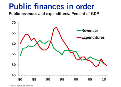
By the late 1980s, Swedish government spending had grown from 30% of gross domestic product to more than 60% of GDP. Swedish marginal income tax rates hit 65-75% for most full-time employees as compared to about 40% in 1960. What happened to the the Swedish economic miracle when the welfare state arrived?

In the 1950s, Britain was also growing quickly, so much so that the Prime Minister of the time campaigned on the slogan you never had it so good.

By the 1970s, and two spells of labour governments, Britain was the sick man of Europe culminating with the Winter of Discontent of 1978–1979. What happened?

Sweden and Britain in the mid-20th century are classic examples of Director’s Law of Public Expenditure. Once a country becomes rich because of capitalism, politicians look for ways to redistribute more of this new found wealth. What actually happened to the  Swedish and British growth performance since 1950 relative to the USA as the welfare state grew?

Figure 1: Real GDP per Swede, British and American aged 15-64, converted to 2013 price level with updated 2005 EKS purchasing power parities, 1950-2013, $US

image

Source: Computed from OECD Stat Extract and The Conference Board, Total Database, January 2014, http://www.conference-board.org/economics

Figure 1 is not all that informative other than to show that there is a period of time in which Sweden was catching up with the USA quite rapidly in the 1960s. That then stopped in the 1970s to the late 1980s. The rise of the Swedish welfare state managed to turn Sweden into the country that was catching up to be as rich as the USA to a country that was becoming as poor as Britain.

Figure 2: Real GDP per Swede, British and American aged 15-64, converted to 2013 price level with updated 2005 EKS purchasing power parities,  detrended, 1.9%, 1950-2013

image

Source: Computed from OECD Stat Extract and The Conference Board, Total Database, January 2014, http://www.conference-board.org/economics

Figure 2 which detrends British and Swedish growth since 1950 by 1.9% is much more informative. The US is included as the measure of the global technological frontier growing at trend rate of 1.9% in the 20th century. A flat line indicates growth at 1.9% for that year. A rising line in figure 2 means above-trend growth; a falling line means below trend growth for that year. Figure 2 shows the USA growing more or less steadily for the entire post-war period. There were occasional ups and downs with no enduring departures from trend growth 1.9% until the onset of Obamanomics.

Figure 2 illustrates the volatility of Swedish post-war growth. There was rapid growth up until 1970 as the Swedes converged on the living standards of Americans. This growth dividend was then completely dissipated.

Swedosclerosis set in with a cumulative 20% drop against trend growth. The Swedish economy was in something of a depression between 1970 and 1990. Swedish economists named the subsequent economic stagnation Swedosclerosis:

  • Economic growth slowed to a crawl in the 1970s and 1980s.
  • Sweden dropped from near the top spot in the OECD rankings to 18th by 1998 – a drop from 120% to 90% of the OECD average inside three decades.
  • 65% of the electorate receive (nearly) all their income from the public sector—either as employees of government agencies (excluding government corporations and public utilities) or by living off transfer payments.
  • No net private sector job creation since the 1950s, by some estimates!

Prescott’s definition of a depression is when the economy is significantly below trend, the economy is in a depression. A great depression is a depression that is deep, rapid and enduring:

  1. There is at least one year in which output per working age person is at least 20 percent below trend; and
  2. there is at least one year in the first decade of the great depression in which output per working age person is at least 15 percent below trend; and

  3. There is no significant recovery during the period in the sense that there is no subperiod of a decade or longer in which the growth of output per working age person returns to rates of 2 percent or better.

The Swedish economy was not in a great depression between 1970 and 1990 but it meets some of the criteria for a depression but for the period of trend growth between1980 and 1986.

Between 1970 and 1980, output per working age Swede fell to 10% below trend. This happened again in the late 80s to the mid-90s to take Sweden 20% below trend over a period of 25 years.

Some of this lost ground was recovered after 1990 after tax and other reforms were implemented by a right-wing government. The Swedish economic reforms from after 1990 economic crisis and depression are an example of a political system converging onto more efficient modes of income redistribution as the deadweight losses of taxes on working and investing and subsidies for not working both grew.

The Swedish economy since 1950 experienced three quite distinct phases with clear structural breaks because of productivity shocks. There was rapid growth up until 1970; 20 years of decline – Swedosclerosis; then a rebound again under more liberal economic policies.

The sick man of Europe actually did better than Sweden over the decades since 1970. The British disease resulted in a 10% drop in output relative to trend in the 1970s, which counts as a depression.

There was then a strong recovery through the early-1980s with above trend growth from the early 1980s until 2006 with one recession in between in  1990. So much for the curse of Thatchernomics?

After falling behind for most of the post-war period, the UK had a better performance compared with other leading countries after the 1970s.

This continues to be true even when we include the Great Recession years post-2008. Part of this improvement was in the jobs market (that is, more people in work as a proportion of the working-age population), but another important aspect was improvements in productivity…

Contrary to what many commentators have been writing, UK performance since 1979 is still impressive even taking the crisis into consideration. Indeed, the increase in unemployment has been far more modest than we would have expected. The supply-side reforms were not an illusion.

John van Reenen goes on to explain what these supply-side reforms were:

These include increases in product-market competition through the withdrawal of industrial subsidies, a movement to effective competition in many privatised sectors with independent regulators, a strengthening of competition policy and our membership of the EU’s internal market.

There were also increases in labour-market flexibility through improving job search for those on benefits, reducing replacement rates, increasing in-work benefits and restricting union power.

And there was a sustained expansion of the higher-education system: the share of working-age adults with a university degree rose from 5% in 1980 to 14% in 1996 and 31% in 2011, a faster increase than in France, Germany or the US. The combination of these policies helped the UK to bridge the GDP-per-capita gap with other leading nations.

Recoveries from recessions across the G-7

The role of new taxes in the Great Recession

 .

The social cost of high company tax rates is just too high

https://www.facebook.com/taxfoundation/photos/a.141113818864.103390.19219803864/10152768107383865/?type=3&src=https%3A%2F%2Fscontent.xx.fbcdn.net%2Fhphotos-xaf1%2Fv%2Ft1.0-9%2F10986904_10152768107383865_2982548121927461497_n.png%3Foh%3D4466db0d4def66a6cf8db895f1ecb037%26oe%3D55D80373&size=850%2C522&fbid=10152768107383865

Levels of output are nowhere near returning to pre-crisis trends

via FRB: Potential Output and Recessions: Are We Fooling Ourselves?.

50% more R&D since the 60s, but still no growth dividend?

Spending on intellectual property products has risen in the USA from 1% in 1950 to 5% now. Public R&D spending in the USA has been pretty static for 60 years. Intellectual property products in the chart below includes traditional research and development, spending on computer software, and spending on entertainment such as movies, TV shows, books, and music. Spending on software and entertainment was only recently measured in the US national accounts. This inclusion of intangible capital investments will radically change the story of economic growth and the business cycle in the 20th century.

image

Source: Chad Jones (2015).

The growth rate in the USA hasn’t changed much despite this massive increase in intellectual property property product production. Is innovation getting harder? R&D is supposed to boost the growth rate, if you are to believe politicians bearing subsidies for it wherever they find it.

image

Source: Chad Jones (2015).

Ben Jones in The Burden of Knowledge and the Death of the Renaissance Man: Is Innovation Getting Harder? found that as knowledge accumulates as technology advances, successive generations of innovators may face an increasing educational burden. Innovators can compensate through lengthening their time in education and narrowing expertise, but these responses come at the cost of reducing individual innovative capacities. This has implications for the organization of innovative activity – a greater reliance on teamwork – and has negative implications for economic growth.

 image

This longer period of education and initial study is not compensated by inventors innovating for longer spans of their lifestyle. This rising burden of knowledge is cutting into their best years of their lives. Jones found a broad and dramatic declines in early life-cycle productivity among great minds and ordinary inventors, and a close relationship  of these trends with increased training duration.

image

Jones found that the age at first invention, specialisation, and teamwork increased over time in a large micro-data set of inventors. Upward trends in academic collaboration and lengthening doctorates can also be explained in his framework of innovation getting harder because of a rising burden of knowledge. Co-authorship in academic literature has increased, including physics, biology, chemistry, mathematics, psychology, and economics. This measure of teamwork has increased 17% per decade.

Using data on Nobel Prize winners, Jones found that the mean age at which the innovations are produced to win the Prize has increased by 6 years over the 20th Century.

  • Before 1901, two-thirds of the Nobel laureates did their prize-winning work before the age of 40 and 20 per cent did it before age of 30.
  • By 2000, however, great achievements seldom occurred before the age of 40.

image

It’s now taking longer for scientists to get their basic training and start their careers. There is simply more to learn because knowledge in all fields has grown by quantum leaps in the past century. Nobels are being handed out for different types of work than a century ago.

  • There has been a trend away from awarding prizes for abstract, theoretical ideas.
  • Now more honours are being bestowed on people who have made discoveries through painstaking lab work and experimentation – which takes a lot of time to do.

Jones’ theory provides an explanation for why productivity growth rates did not accelerate through the 20th century despite an enormous expansion in collective research effort and levels of education and many more graduates. Innovation is getting harder?

Average tax rates on consumption, investment, labour and capital in USA, UK and Canada, 1950-2013

Income taxes in the USA and UK didn’t change all that much after the mid-70s. Prior to that, income tax rose quite steadily in the UK in the 1950s and 1960s and not surprisingly, Britain was the sick man of Europe in the 1970s. Income taxes rose quite steadily in Canada for most of the post-war period up until 1990 and then levelled out for most of that decade before a small tapered downwards.

image

Source: Cara McDaniel.

Taxes on consumption expenditure were very different stories across the Atlantic. There has been a tapering down in the  average tax rate on American consumption expenditure since 1970 after modest increases before that. Canadian taxes on consumption expenditure rose steadily until the 1970s, then drop steadily  in the 1970s  and than rose  in the 1980s and dropped again after 1992. British taxes on consumption expenditure rose sharply in the late 1960s,  dropped sharply and then rose again in the 1970s and was pretty steady after that.

image

Cara McDaniel.

The sleeper tax in all three countries was payroll taxes to fund social security and the welfare state. These rose steadily in the USA, UK and Canada up until the 1990s.

image

Source: Cara McDaniel.

Despite all that nonsense about neoliberalism from the  Left over Left, the average rate of tax on capital income did  not appear to change much at all over the last 50 years. There was a modest taper in US capital income taxation from the mid-30s to the mid-20s over the entire post-war period. The average Canadian tax rate on income from capital rose steadily in the 60s, fell steadily in the 70s before  rising again in the  mid-1980s and fell again after 2000. The average British tax rate on capital income rose steadily in the 60s and 70s, coinciding with the emergence of Britain as a sick man of Europe, and then stabilised in the the 1980s onwards but with a dip in the late 80s before a rise in the early 1990s.. Despite the large cuts in the statutory corporate tax rate in the UK, there was only a mild taper in the average tax rate on capital income in the UK. 

image

Source: Cara McDaniel.

The average tax rate on investment expenditures is pretty stable in the USA  for the entire post-war period. The only significant increase in the average tax rate on investment expenditures in the UK  coincided with the emergence of the sick man in Europe after a drop in the early 70s. The average tax rate on investment expenditures do not change at all in the UK after the 1970s. The Canadian average tax rate on investment expenditures is higher than elsewhere. It rose steadily in the 50s and 60s, dropped in the 70s and rose again in the 80s before tapering  from 1992 onwards.

image

Source: Cara McDaniel.

These higher on rising taxes and the UK and Canada did nothing for either country in catching up  with the USA. The figure 1 below shows real GDP per working age per American, Canadian and British.

Figure 1: Real GDP per Canadian, British and American aged 15-64, converted to 2013 price level, updated 2005 EKS purchasing power parities, 1950-2013

image

Source: Computed from OECD StatExtract and The Conference Board, Total Database, January 2014, http://www.conference-board.org/economics

The USA is pulling away from Canada and the UK in GDP per working age person. The exception is British economy from about 1990 onwards which caught up with Canada.

Figure 2, which is detrended GDP data, illustrates the British economic boom in the 1990s. Each country’s annual economic growth rate is detrended by 1.9%, the detrending value currently used  by Ed Prescott. A flat line is growth at 1.9%, a rising line is above trend growth, a falling line  is below trend growth.

Figure 2: Real GDP per Canadian, British and American aged 15-64, converted to 2013 price level, updated 2005 EKS purchasing power parities, detrended 1.9%, 1950-2013

image

Source: Computed from OECD Stat Extract and The Conference Board, Total Database, January 2014, http://www.conference-board.org/economics

Figure 2 shows that Canada has been in a long-term decline since the mid-1980s  with much of this decline coinciding with periods of rising taxes on income from labour.

The British economy boomed in the 1990s, after the tax hikes of the 1970s and early 80s were reversed. This growth dividend was squandered by the Blair government in the 2000.

Figure 2 also shows that US growth was rather stable with some ups and downs up until 2007, expect during the productivity slowdown in the 1970s. The first major departure from trend growth of 1.9% was with the onset of the great recession.

Average tax rates on consumption, investment, labour and capital in Australia and New Zealand, 1959-2011–updated

Cara McDaniel went to the mammoth task of constructing average tax rates for 15 OECD countries over the period 1950-2003 for consumption, investment, labour and capital:

Total tax revenue is divided into revenue generated from four different sources: consumption expenditures, investment expenditures, labour income and capital income.

To find the average tax rate, tax revenue from each source is then divided by the appropriate income or expenditure base.

She used that data to examine the role of taxes and productivity growth as forces influencing market hours. She used a calibrated growth model extended to include home production and subsistence consumption, both of which were key features influencing market hours. Her model was simulated for 15 OECD countries. She found the primary force driving changes in market hours is found to be changing labour income tax rates and productivity catch-up relative to the United States is found to be an important secondary force.

I thought I would summarise the tax rate data computed by Cara McDaniel for Australia and New Zealand.

image

Source: Cara McDaniel.

McDaniel’s data on average tax rates on household incomes in Australia and New Zealand suggests that the average tax rate New Zealand household incomes fell by a third since 1986. No estimates were calculated for earlier years for New Zealand.

As for Australia, taxes steadily increased between 1959 and 1987 stabilised until 2005 and then fell a bit.

image

Source: Cara McDaniel.

There is a big spike in the average tax rate on consumption expenditure in New Zealand in 1986 when a GST replaced the pre-existing sales taxes. The average tax rate on New Zealand consumption expenditures and tapered away until the end of2009 and started to increase again.

Not much happened in Australia regarding the average tax rate in consumption expenditures since about 1983 despite the introduction of a GST in 1998.

image

Source: Cara McDaniel.

The average tax rate in capital income in Australia is much higher than in New Zealand. On the other hand, the average tax rate on investment expenditure is much higher New Zealand as compared to Australia.

image

Source : Cara McDaniel.

Taxes on investment expenditures increased quite significantly at the same time that a GST was introduced in New Zealand.

All in all, New Zealand cut taxes on personal income but that tax cut seemed to be pretty much offset by higher taxes on personal consumption through the introduction of a 10% and then 12.5% GST.

The most interesting finding in this database is the sharp increase in the average tax on investment expenditures in the mid-1980s. This prolonged New Zealand’s lost decades – the two decades of next to no GDP growth per working age New Zealander.

Real GDP per New Zealander and Australian aged 15-64, converted to 2013 price level with updated 2005 EKS purchasing power parities, 1956-2013

image

Source: Computed from OECD Stat Extract and The Conference Board, Total Database, January 2014.

New Zealand’s lost decades ended when the average tax rate on investment expenditures started to fall.

Relative productivity across the major economies

Previous Older Entries Next Newer Entries

Bassett, Brash & Hide

Celebrating humanity's flourishing through the spread of capitalism and the rule of law

Truth on the Market

Scholarly commentary on law, economics, and more

The Undercover Historian

Beatrice Cherrier's blog

Matua Kahurangi

Celebrating humanity's flourishing through the spread of capitalism and the rule of law

Temple of Sociology

Celebrating humanity's flourishing through the spread of capitalism and the rule of law

Velvet Glove, Iron Fist

Celebrating humanity's flourishing through the spread of capitalism and the rule of law

Why Evolution Is True

Why Evolution is True is a blog written by Jerry Coyne, centered on evolution and biology but also dealing with diverse topics like politics, culture, and cats.

Down to Earth Kiwi

Celebrating humanity's flourishing through the spread of capitalism and the rule of law

NoTricksZone

Celebrating humanity's flourishing through the spread of capitalism and the rule of law

Homepaddock

A rural perspective with a blue tint by Ele Ludemann

Kiwiblog

DPF's Kiwiblog - Fomenting Happy Mischief since 2003

The Dangerous Economist

Celebrating humanity's flourishing through the spread of capitalism and the rule of law

Watts Up With That?

The world's most viewed site on global warming and climate change

The Logical Place

Tim Harding's writings on rationality, informal logic and skepticism

Doc's Books

A window into Doc Freiberger's library

The Risk-Monger

Let's examine hard decisions!

Uneasy Money

Commentary on monetary policy in the spirit of R. G. Hawtrey

Barrie Saunders

Thoughts on public policy and the media

Liberty Scott

Celebrating humanity's flourishing through the spread of capitalism and the rule of law

Point of Order

Politics and the economy

James Bowden's Blog

A blog (primarily) on Canadian and Commonwealth political history and institutions

Science Matters

Reading between the lines, and underneath the hype.

Peter Winsley

Economics, and such stuff as dreams are made on

A Venerable Puzzle

"The British constitution has always been puzzling, and always will be." --Queen Elizabeth II

The Antiplanner

Celebrating humanity's flourishing through the spread of capitalism and the rule of law

Bet On It

Celebrating humanity's flourishing through the spread of capitalism and the rule of law

History of Sorts

WORLD WAR II, MUSIC, HISTORY, HOLOCAUST

Roger Pielke Jr.

Undisciplined scholar, recovering academic

Offsetting Behaviour

Celebrating humanity's flourishing through the spread of capitalism and the rule of law

JONATHAN TURLEY

Res ipsa loquitur - The thing itself speaks

Conversable Economist

Celebrating humanity's flourishing through the spread of capitalism and the rule of law

The Victorian Commons

Researching the House of Commons, 1832-1868

The History of Parliament

Articles and research from the History of Parliament Trust

Books & Boots

Reflections on books and art

Legal History Miscellany

Posts on the History of Law, Crime, and Justice

Sex, Drugs and Economics

Celebrating humanity's flourishing through the spread of capitalism and the rule of law

European Royal History

Exploring the Monarchs of Europe

Tallbloke's Talkshop

Cutting edge science you can dice with

Marginal REVOLUTION

Small Steps Toward A Much Better World

NOT A LOT OF PEOPLE KNOW THAT

“We do not believe any group of men adequate enough or wise enough to operate without scrutiny or without criticism. We know that the only way to avoid error is to detect it, that the only way to detect it is to be free to inquire. We know that in secrecy error undetected will flourish and subvert”. - J Robert Oppenheimer.

STOP THESE THINGS

The truth about the great wind power fraud - we're not here to debate the wind industry, we're here to destroy it.

Lindsay Mitchell

Celebrating humanity's flourishing through the spread of capitalism and the rule of law

Alt-M

Celebrating humanity's flourishing through the spread of capitalism and the rule of law

croaking cassandra

Economics, public policy, monetary policy, financial regulation, with a New Zealand perspective

The Grumpy Economist

Celebrating humanity's flourishing through the spread of capitalism and the rule of law

International Liberty

Restraining Government in America and Around the World